Wiki:
Page name: Creating_The_Spazznik_Comic [Logged in view] [RSS]
2008-07-01 06:12:39
Last author: Hendercrazy
Owner: Hendercrazy
# of watchers: 5
Fans: 0
D20: 5
Bookmark and Share
<img:http://elftown.eu/stuff/SpazznikPencil.jpg>


Creating the Spazznik Comic


By Derek [Hendercrazy] Henderson


By special request... I'll be showing you how I'm currently putting a Spazznik comic together from start to finish. Be prepared to be entirely bored. XD *Spoiler Alert* - I'll be showing the creation process of comic episode number five and slightly give away some other tidbits about Spazznik you may or may not want to know. :)


- [Hendercrazy]


The Comic Concept
The first thing you need in creating a comic strip is a great concept that you'll be happy with. A unique idea that's all yours and yours alone. One that you'll be willing to dedicate yourself to. A concept you'll devote a ton of time and energy into. One that should be funny and amusing. One that can have lasting entertainment value. One that... eh, you get the idea. XD

A great concept includes...

• A cast of character(s). [In this case: Spazznik, The King and Queen Strongheart, The Royal Court of Strongheart, ect.]
• A setting (place and time). [Spazznik takes place in a high fantasy setting with a medieval era vibe.]
• An overall theme. [Spazznik is an energetic foot soldier for the noble family of Strongheart. The only problem is he's been assigned to guard duty on the outer wall of the city.]
• An ongoing plot or storyline. [Spazznik seeks to get out of guard duty and honor his king by successfully going on duty adventures in the king's name.]


The Comic Format
When you finally have your great concept put together... it's now high time to figure out what format you want to write and illustrate your comic in. There are plenty of standard comic formats out there. Do some research and find something that best suits you and what you feel you're capable of. If there's no format out there you really care for... design your own. [Spazznik is starting off a standard three panel comic strip format in full color.]


The Comic Script
It's always best, in my opinion, to write each comic out in a comic script format. Doing this helps you a few different ways. One, it helps you organize the comic as a whole. Two, it helps you keep track of what's going on in each panel (including characters, background, action, dialog, sound effects ect.). Three, it easily puts things into perspective on how you'll want to illustrate the comic by reading how much you have involved and going on.


Spazznik, Volume 1 • Episode 5


Panel 1
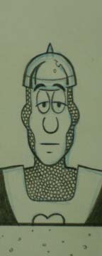
Spazznik is in his usual spot along the outer wall of the city while on guard duty. He's incredibly bored sitting there. He's partially slouched over with his head resting on his right hand. His spear sitting off to his right leaning on the wall. He's looking straight at the reader.

Spazznik:(Thought balloon) "I'm sooo bored sitting around on this wall all day."

Panel 2
Spazznik, still in the same spot on the wall, springs to life excited that he just came up with a brilliant idea. His eyes are big, his mouth has an open smile with teeth showing and his left hand is raised and clenched but pointing upward with his index finger to express that he has that idea.

Spazznik: (Thought balloon) "I bet the NIGHT SHIFT is MUCH MORE EXCITING than this!!!"

Panel 3
Spazznik is still in the same old spot... but it's now night time. The sky is clear with stars shining for miles. However, he's now back to his exact same bored pose as in Panel 1. Except he now has an even more disappointed look about him because there's no change in guard duty action.

*Cricket Sound Effects*

Spazznik: *Sigh!*


The Comic Thumbnail

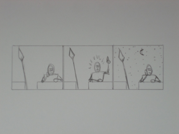
<img:stuff/SpazznikThumbnailComic.jpg>

A comic thumbnail is simply a really small drawing you formulate directly from your comic script to achieve the basic idea and layout of your comic. If you have a really complex comic... you may need to do many thumbnails until you get the effect(s) out of the comic you're striving for. This includes everything from the characters poses and positions, different viewpoints and perspectives, backgrounds, ect. while also leaving room for action lines, word balloons and sound effects. [Right now, I'm starting off Spazznik with a simple two dimensional view and virtually no depth with the character or background since Spazznik is completely by himself and on the wall in this first series of strips. I'm paying homage to the old school comic strip artists and writers. You know, the olden days when all three panels of the strip would show the character(s)in the same exact position and place, with little to no movement. Especially when all three panels are each "hand drawn"! It's a lot harder to illustrate than most would think. If you're an artist... try a few. It's a great eye-opening artistic exercise. :)]


Sketching the Actual Comic

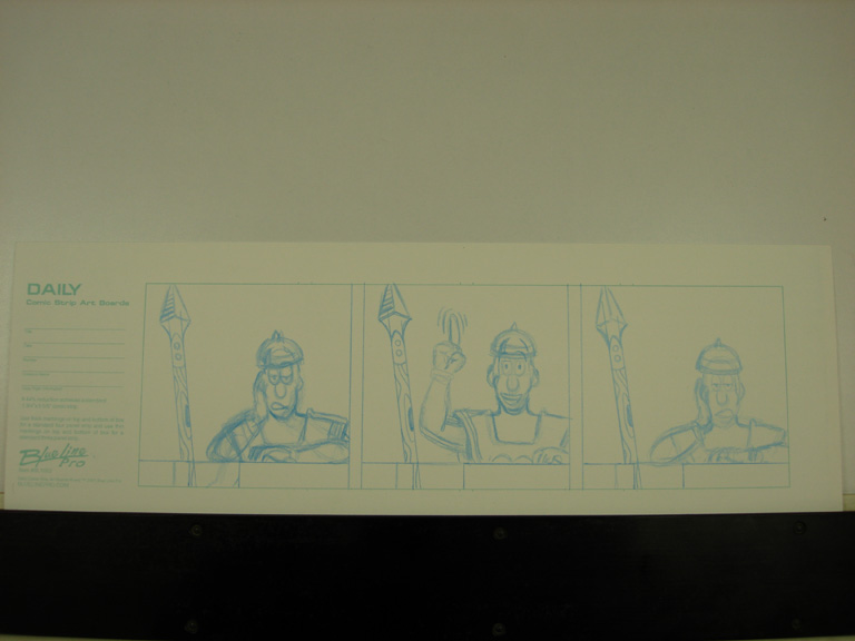
<img:stuff/SpazznikSketchComic.jpg>

It's now time to begin working on the actual comic itself! :) Using your thumbnail as a layout reference, begin loosely flushing out your panels, figures, backgrounds ect. I always use a non-photo blue lead first so I can go toss the lines around quite a bit. Especially if I feel like changing/adjusting anything. Sometimes my sketches end up looking quite messy. XD You'll notice I decided to zoom in on Spazznik a bit more from the thumbnail to keep it consistent with the previous comics. I also changed Spazznik's raised arm in the middle panel.

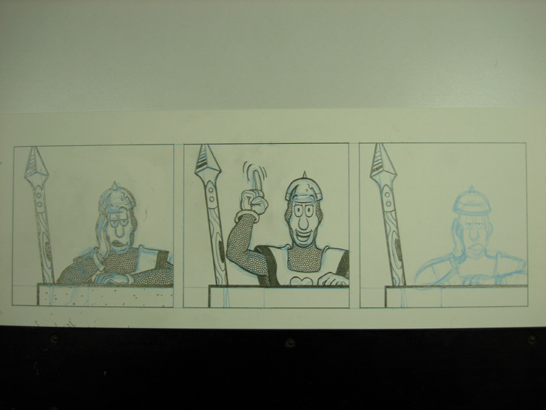
<img:stuff/SpazznikWIPComic.jpg>

Now I've begun to go over the blue pencil with regular pencil.   Currently, I'm using a hard lead (2H) to finalize the art because I'm doing finished pencils and "inking" all at the same time. It is here that I'll tighten up the previous pencil lines and correct things that don't look right. Also, since I'm technically "inking" this as I go too (with the pencil)... I'm giving the linework line weight values and honing fine details. The pic above shows the contrast of the two.

<img:stuff/SpazznikPencilComic.jpg>

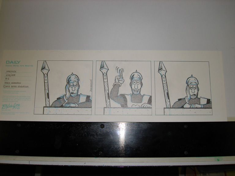
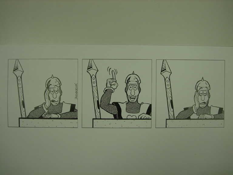
The end result is finished pencils with an "inked" look. Now I go back with an erasure and clean-up the loose ends, smears and oddball markings. I also use white-out on permanent markings and/or imperfections in the paper to prep for the copy center.

<img:stuff/SpazznikPhotocopyComic.jpg>

Now all I do is go to the local copy center (I prefer FedEx Kinkos) and have professional laser copies made on white laser paper. I have them adjust the darkness level to black making the pencil appear as "black ink" and make sure the non-repo blue pencil gets entirely eliminated. Sorry for the bad photo... but you get the idea if you compate the original to the copy. This sets things up now for traditional coloring.

Username (or number or email):

Password:

2008-03-15 [Hendercrazy]: This page is honored to Jason [organicparadox] and any others who might be interested in how I'm slopping the comic together. XD

2008-03-17 [organicparadox]: /bow!

thanks man. i am nut for seeing art through other artist's eyes. especially people with a vein for putting gross amounts of detail in their work. i'll be watching this one:)

question though. do you write out each scene like you did here, or do you do it in your head?

2008-03-17 [Hendercrazy]: I come up with them initially in my head... but shortly thereafter I'll translate them to paper before I forget 'em.

2008-03-18 [organicparadox]: do you write it out, or sketch your ideas first?

2008-03-18 [Hendercrazy]: Everything is written first... thumbnailed second... sketched third... then drawn.

2008-03-18 [Dark Side of the Moon]: Always the story before the art! ;)

2008-03-21 [Hendercrazy]: Thumbnail is up. Comic sketch is next!

2008-03-24 [organicparadox]: awesome, thanks man for posting the thumbnail. what scale do you normally sketch those in? really small, or closer to the actual size? does it vary? do you sketch on whatever seems to be close at hand, or are you more methodical?

2008-03-24 [Hendercrazy]: My thumbnails really aren't any specific size or consistent. The only important thing is that you keep redrawing the thumbnails until you get the layout of the comic the way you want it. They're just for reference for when you begin to sketch the real thing out. The thumbnail posted above is about one-third of the actual comic strip size. So very small and very loose.

2008-03-24 [organicparadox]: do you plan to follow the same creation process when you branch out beyond the classic 3 panel format? or do you handle other forms of sequential art differently?

2008-03-24 [Hendercrazy]: It's all done the same. The only thing that changes is the format size, number of panels and complexity in the storytelling.

2008-03-24 [organicparadox]: great food for thought man. i have a story that has been in my head since i was a kid, but every attempt to do it in the past has been hampered by not fleshing out the plot enough and brickwalling on the story after a few pages into it. trying to find the best way to approach it, now that i'm kinda starting over with my art.

i'll continue to keep a close eye on ya:)

2008-03-24 [Hendercrazy]: If you have a large story... plot it out in an outline first.

I. Introduction
 A. Organic Paradox introduced to the reader.
  1. Organic flies through a warehouse window making dramatic entrance.
  2. Organic swiftly takes down thugs to gain information.
   a. Organic disables the thugs weapons in the process.
II. Origin of Organic
 A. Organic goes into flashback mode while standing over unconscious thugs.
  1. Points out growing up in a rough neighborhood.
  2. The accident that changed his life.
  3. The government cybernetic implants put in during surgery.
 B. Jason decides to use his new hardware for the good of human kind.
III. Searching for the thug crimeboss.

2008-03-25 [organicparadox]: thanks man. i am working on a tolkienesque epic. i'll give the outline format a serious effort and hit you back with the results:)

on a more related note, i liked the thumbnails a lil more than your rough pencils. the distance from the camera seemed perfect for that last shot, showing the stars. further away of a shot, would kind of help illustrate how lonely he gets up there. (just thinking out loud, [TheRogue] will tell ya that i love playing devil's advocate)

2008-03-25 [Hendercrazy]: While I do agree with you that the thumbnail view is better... I'm tackling this comic in a very unorthodox way. There is a short term and longterm reason why. The short term reason I changed it back to the standard view is because the first volume of strips is intentionally focusing directly up close on Spazznik and his personality only. Spazznik's reaction, the darkness and crickets in this strip is what sells it. The longterm reason is I have plans for expanding when it morphs into a new format. ;)

2008-08-13 [Hendercrazy]: At some point down the road here, I'm going to refresh this wiki with how I colored this strip traditionally. Then, eventually I'll cover how I color it digitally now that I have my scanner back. It'll be awhile though before I'll get to redoing the first 6 strips over in digi color! << :)

Show these comments on your site

Elftown - Wiki, forums, community and friendship.