Wiki:
Page name: Fishman Villager [Logged in view] [RSS]
2009-10-11 10:24:33
Last author: Karithina
Owner: Karithina
# of watchers: 2
Fans: 0
D20: 13
Bookmark and Share
Previous: Kreaturen Project 2011Up: Art by Karithina: Carly Rose SheilNext: Darkness Nude Study

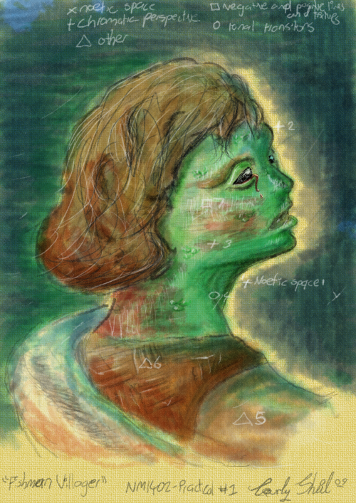
Fishman Villager


<img500*0:stuff/aj/187594/Fishman.png>

Funny story, I was so tired from studying for this that I put down NM1402 (my class being 1502, a visual art class unlike 1402 which is a design class that I apparently have next semester) and Week 7 (this week being Week 8) on top of what I noticed even at the time as a highly unoriginal name brought on by the fact I had a song about fishmen in my head.
I'm fairly sure my lecturer will think I was high... I sure would have. I put 1402 down both file names, as well as both pages...

I'm thinking sleep would be a good idea if I weren't so amazingly productive late night/morning.

Now don't laugh, I probably screwed up a lot, I've been scared to check it:

"Noetic Space (1) was coined by Gordon “James” Brown of James Cook University to explain the gap left between an object and it’s background on the shadowed side in order to enhance the depth reality of an object. I’ve used it in my painting in almost an exaggerated fashion along the right side of the background behind the face where the shadow is found on the foreground (the face).
I’ve used Chromatic Perspective along the right side of the face (2) in order to push that side of the face back, although the face is not in actuality turning, I’m attempting to give the impression of movement by using the cool colours to effectively push the face away. Around the
cheekbone (3), browline and neck I have used warmer colours to enhance the curve of their forms and bring them closer.

I’ve used tonal transitions throughout the piece, more noticeable around the right side of the neck (4) where I’ve deepened the neck with a darker tone and faded it back to the lighter midtones and highlights of the remainder of the neck. Lloyd Rees, a famous draftsman makes great
use of tonal transitions in his etching The Giant Fig Tree where he enhances the curves to the tree with his dark and light tone, creating a smooth, bright appearance.

Anthony van Dyck used Vignettes in his portraits to draw attention to the subject’s face. I’ve attempted to replicate this through using more detailed marks around the face and fading out to near nonexistant lines as they recede from the facial area. Throughout my painting I have made use of white flecks (6) to increase the traditional appearance of my digital painting. This technique was used
most noticeably by M.C. Escher who I also attempted to replicate in my
CubeStudy 1 and CubeStudy 2 . Where I also used his repetitive optical
illusion style and an almost pencil-like texture.

Mainly in the facial area (7) I made great use of negative and positive lines, with my positive lines being white and vertical and my negative lines being black and horizontal. I used them to enhance the tone and glossy sheen of the man’s face."

/ [Karithina]


Username (or number or email):

Password:

2009-06-27 [jts7788]: I really like this piece

Show these comments on your site

Elftown - Wiki, forums, community and friendship.