| Entrance | Mainstreet | Wiki | Register |
|
# of watchers: 3
|
Fans: 0
| D20: 12 |
| Wiki-page rating |  Stumble! Stumble! |
| Informative: | 0 |
| Artistic: | 0 |
| Funny-rating: | 0 |
| Friendly: | 0 |


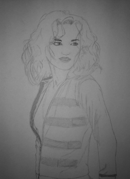
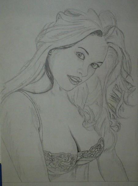
2007-01-25 [m3_di]: Hmm. Very nice girls ;D I have one suggestion that, I think, will make their faces look more natural - why don't you try not lining up their lips? Just give them some color without the thick lines. It will give the face a softer look, more feminine, I think. It looks like a really dark lip.. liner, or how do you call it? ^^
2007-01-25 [Glitch of Darkness]: bad scan and sloppy and quick?!?! I'd really like to see your not sloppy quick ones! I couldn't do something like this in a month!
2007-01-26 [The Alchemist]: to m3-di: so you mean just colouring but no outer lines right.. hmm that might just work, thanks
2007-01-26 [The Alchemist]: to glitch: not-sloppy-qui
2007-02-02 [rhubix]: You have a good start here, the second image is much stronger then the first. The face on the first is slightly out of proportion (the mouth should be half way between the nose and the chin)
In general ( I was reading your comment at the beginning)I strongly suggest you study anatomy and life drawing before you even start to worry about hair. You can't draw really good hair until you understand the shape of the skull after all.
some suggestions about these pieces indiviudally:
1. I mentioned the mouth so I wont dwell, The hair is looking pretty good so far, (it seemed to be your focus) the major thing that stood out when I looked at this image is the very dominating neck- muscle on the left. This muscle actually starts attached to the bottom of the back of the skull then spirals around the neck and connects to the collar bone. the one you drew seems a bit un-directed and drawn very strongly. Even if a referance photo has a very strong musle there, it's uaually better to sub-due it especially in women, just because it looks nicer.
2. I like this image more, it's starting to come together quite nicely. the detailing, especially in the bra are nice. Before you get into detailing though it's usually best to have the general things worked out The arm closest to us is a bit too cylinder like. in cartoons this works out but in portraits and more realistic things it's nice to have a bit of the under-lying anatomy deciding on the forms, even if the referance doesn't really have alot of it. I don't know if you used a referance or not but if you do you should always remember that photo's don't always show everything, and now-a-days people photoshop everything so much it's hard to know what's what.
M3_di's suggestion about the lip was a good one, this also applies to everything elce as well though. around the eyes and the nose alot of the form can be described with tone rather then line.
anyways I'll stop ranting now :D I tend to get over excited when talking about drawing .
2007-02-03 [The Alchemist]: euhm yea, good tips but may i remind you, these are just quick sketches, i just started drawing them.
2007-03-19 [Nicoda]: Wow! No I like the first one...I don't know why but I kinda like the face like that.
By the way some people have long chins...
Anyway my fav. part is the hair. I really like it.
| Show these comments on your site |
|
Elftown - Wiki, forums, community and friendship.
|