
 Written by [Asrun]
Composition
The combining of distinct parts or
Arrangement of artistic parts so as to form a unified whole.
Negative Space
Empty space, space around an object or form; also called white space.
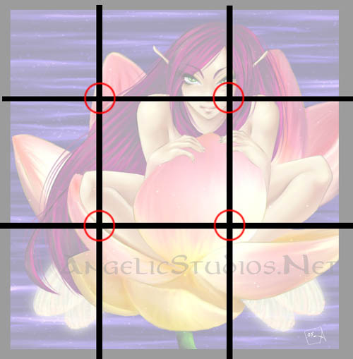
When it comes to composition, there is a term that developed in the Renaissance known as "The Golden Section". The golden section is basically the brake down of your picture plane (drawing surface) into distinct 1/3 sections. Where those sections meet up is the best place to place your focal point (where you want your audience to look).
Notice how in the example, there are key elements in and around the golden sections. Keep this in mind when you're placing an image. Slightly off centre is a good thing!
Cropping in close can also add dynamics. Try having stuff cropped off at the edges. DO NOT however, crop directly down the centre of an object.
Ratios are big issue in design. If you break them you could end up with something that looks awesome, that goes against the flow in traditional design.. Or you could end up with a disaster. Remember, you should understand these ratios before you break them.
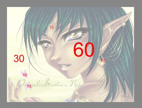
We've already discussed the 1/3 ratio of the golden section, and now lets go on to the 30/60/10.
Nono, this isn't math. 30/60/10 ratio is easy to remember. You should have one LARGE (60) element in your design (usually the focal point), a couple MEDIUM(30) elements, and then some SMALL (10) elements that fill your picture plane. This creates a first impression when you first see the image, and also gives it more things to look at.
Remember that gravity effects design as well. Larger images will appear heavier and weigh down your image, while the smaller ones will appear lighter.
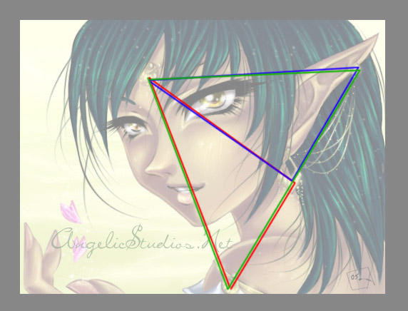
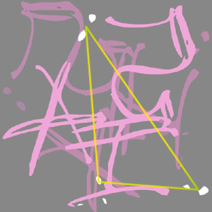
Triangulation is another neat compositional effect that I'm going to talk about. Elements that create a triangle(s) within the picture plane is an easy way to create dynamics.
Here are two examples. One with multiple triangles, the other with one. There are many other aspects of composition that I just can't cover in one tutorial, so we'll move on to negative space.
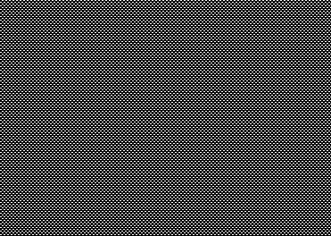
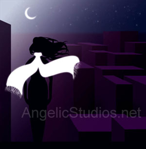
Negative space is the area that surrounds your objects in the picture plane. Using it effectively can make that space even more important that the object itself. Why? Because it is what defines your object. Negative space also gives the eye a place to rest. Which is why I use it a lot in my images. You might think I'm just being lazy by leaving stuff solid black or white. You think I'd do that on purpose? (Okay, maybe you're right.. I am lazy.. Just like every other designer.. :P) But really, there's logic behind it.
See the first image on the left? BLEH! Makes you want to not look at it right? Even though it's a neat pattern, it hurts your eyes, and it makes your eyes want to go to the solid colour around it, that's not even a part of the image.
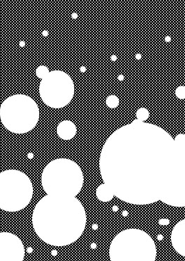
Now, look at the new version. See how your eye can relax on the white circles? That my friend is the power of negative space.
Try using negative space to cut through an image. You might end up with a really neat element in your image that you otherwise might not have had.
Combining these two major design elements will help your work develope into something that will not only please the eye but will also make your audience want to look deeper into your work. That's the key of good design.
 Stumble!