Draw Like Trin.
A Tutorial by [Triola].
Sooooo, you wanna draw like Trin? Eh? Eh? Well, this tutorial is here to show you
exactly how to do that? Excited? You should be! Let’s get this show on the road!
Sketch
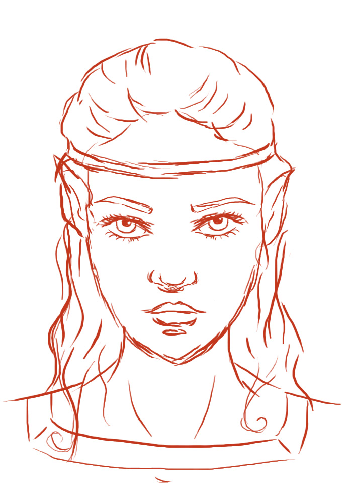
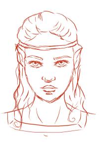
First off, you need a sketch. Yes, you do, You
really do. I used to draw without sketching before, because sketching took such a goddamn long time (in my previous opinion), and the result was that my art looked like crap. When working with lineart, as I do, sketching can only improve your work. So yes, a sketch.
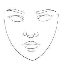
Now, for my sketch, we’ll do a random girly face, because that is what I do best. Like this one:
(Click for larger)
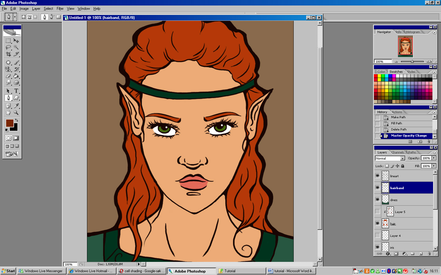
As you can see, I have my sketches in red, so that I can easily see the difference between the sketch and the lines when I draw on top it.
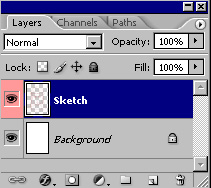
Oh, yeah, this seems so obvious to me, but always remember, layers are love. This is what we currently have:
Now, onto the lineart!
Lineart
I like lines. The blacker and the crisper the better, usually, but I have several different ways to do them.
1.
Thick, black and crisp. This is the one I usually use.
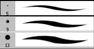
For this type of line art, I use hard brushes, in two different sizes. Usually five and nine pixel diameter if it’s a smaller scale picture, and nine and thirteen on a larger scale one.
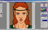
Now, what I do is I make a third layer, and then I just draw really. I zoom in to about 250% to 350%, and I alternate between the smaller and the larger of the two brushes, and also make good use of the pen pressure, to make sure some lines are large and thick, while some are thin.
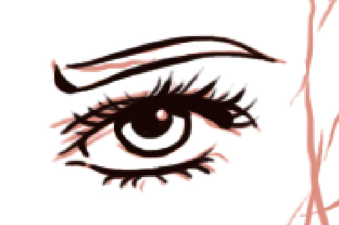
Here’s the zoomed in lineart of one eye, on top of the sketch
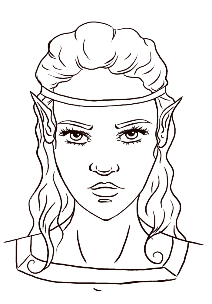
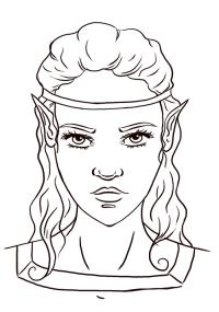
Do this to the entire thing and it will look something like this:
(Click for larger)
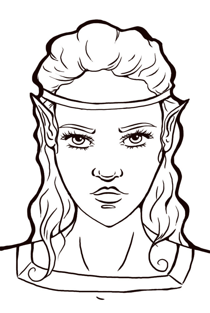
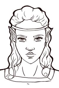
Now, these lines are a little bit sloppier than usual, because I can’t be bothered to use a lot of time on this, but yeah, I hope you get the picture. In addition to this, I often also take a larger brush, like say a pixel 19 one, and go over the lines afterwards, making some parts bolder and also outlining the lines ( if you understand what I mean by that), as you can see here:
(Click for larger)
Also, as you can see, typical “line intersections”
, where lines cross other lines, are often made smoother by rounding out corners and such.
And there you have it, lineart type nr. 1!
2. Vectors, vectors, vectors!. As you can tell, this kind of lineart is done by using Photoshop’s vector tool, i.e. pen tool. A very nifty little thing, which makes for some incredibly smooth lines, but I don’t use it very often because it’s rather time-consuming work.
But anyhow, what’cha need to use is this tool:
Now, I don’t know how familiar yous people are with the pen tool, but I’ll give a short introduction to how to use it anyhow! (By the way, this tool is very awesome for those of you without tablets, because you can make superb lines with just your keyboard and mouse).
First, you select the pen tool and you click somewhere on your layer, making a small square like this

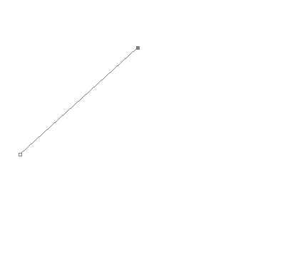
Then you click another place, and you get a line, like this
If you click on a third place and drag your mouse while you click, you will make a curved line, like this
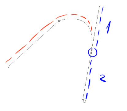
Now, the red lines show the path you’ve just created, but as you can see, when you create a curved line you get these two other lines as well (shown in blue). Line one dictates the curve of the line you’ve just created, but, and here comes the annoying part, line two dictates the curve of the next part of the path you’ll create if you click somewhere else on the layer. Sooo, what do you do if you want the next part of the path to be straight? Or less curved? Well, you use the Alt button. The Alt button lets you pick up the small dot at the end of line nr. 2 (here made bigger and greener for your convenience)
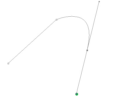
And move it so that the lines is shorter, thus creating a less curved path, or until the line is nonexistent, making it possible to have the next part of the path completely straight.
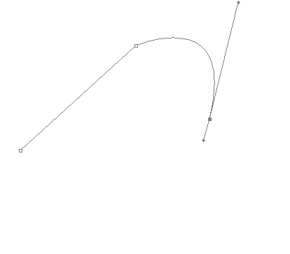
Here for a less curved path.
Now, in addition to this, you have the ctrl button, which is nifty because it lets you end the path you’re currently working on, by clicking somewhere outside of the path while holding the ctrl button in, after which you can start somewhere else on a new path, like this:
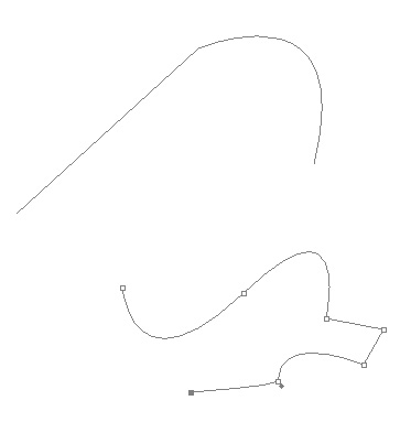
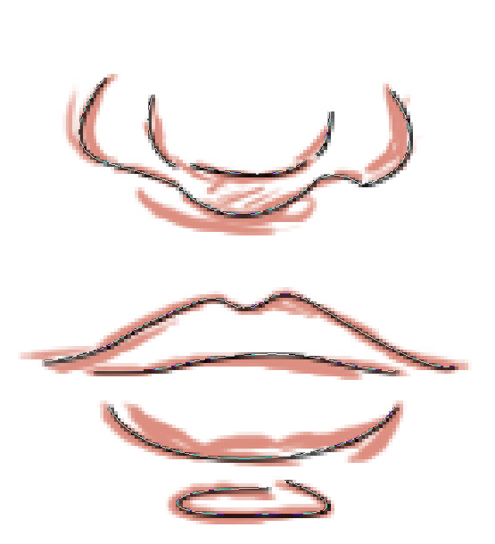
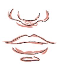
Now, onto the part where we turn this knowledge into art! First, you still have your sketch, yes? Take the nose and mouth part of my sketch, for example. Select the pen tool and click down at the beginning of a line, then make a path that follows your line to the exact.
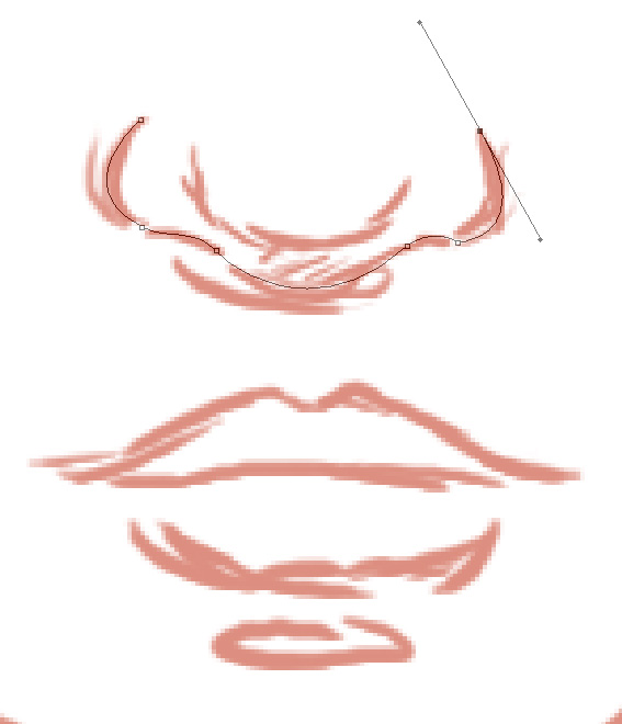
And then continue until you have a path that follows your sketch to a T.
(Click for larger)
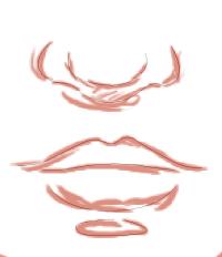
Now comes the fun part. Select a 1 pixel brush, click on the pen tool again, and then right click on your picture and choose “Stroke Path…” When this box comes up, click OK.
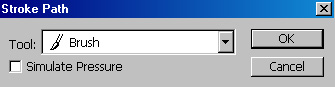
The result will look something like this
(Click for larger)
Now, what I usually do, is I choose a larger brush, say 3 pixels for this image, and then I repeat the process. Only this time, when the box comes up, make sure that you have checked off the box for “Simulate Pressure”.
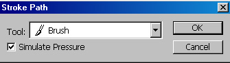
Right click on the layer again and choose “Delete Path” to make the path go away. The result will look something like this:
(Click for larger)
(Also, I couldn’t be bothered to do the whole thing >.>)
But yeah, don’t be shy, play around with different brush sizes, pressure, no pressure etc. Have fun with it!
So that’s how I do lineart, mainly. For a third way, which I’ve pretty much stopped doing, go to Triola's Lineart Tutorial.
Now, on to the colouring!
Colouring
When I colour I have two ways of shading, the easy and the hard. But both of them start with the same base, so let’s do that first: fill in your drawing with flat colours. They go on new layers underneath the lineart layer, like this:
(Click for larger)
Notice all the layers? Layers are your friends!
Now to the shading.
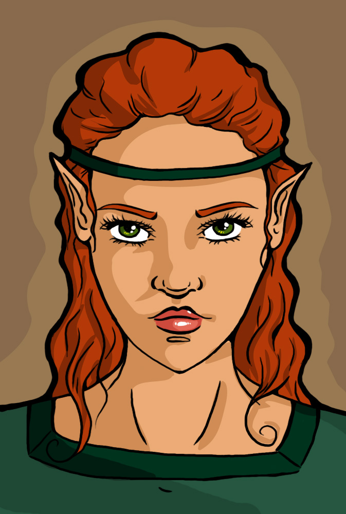
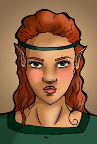
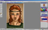
1. Cell-shading. The easy, the boring, the cartoonesque. With this shading, you find the colour of say the skin, go a few shades darker, and draw hard-edged “cells” of flat coloured shadows. Do it to all the different colours, then add some hard white highlights to the lips and eyes, and you’ll end up with something like this:
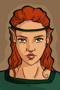
(Click for larger)
A perfectly respectably piece of lineart and colour.
Now, for the harder and more time-consuming colouring method, we go
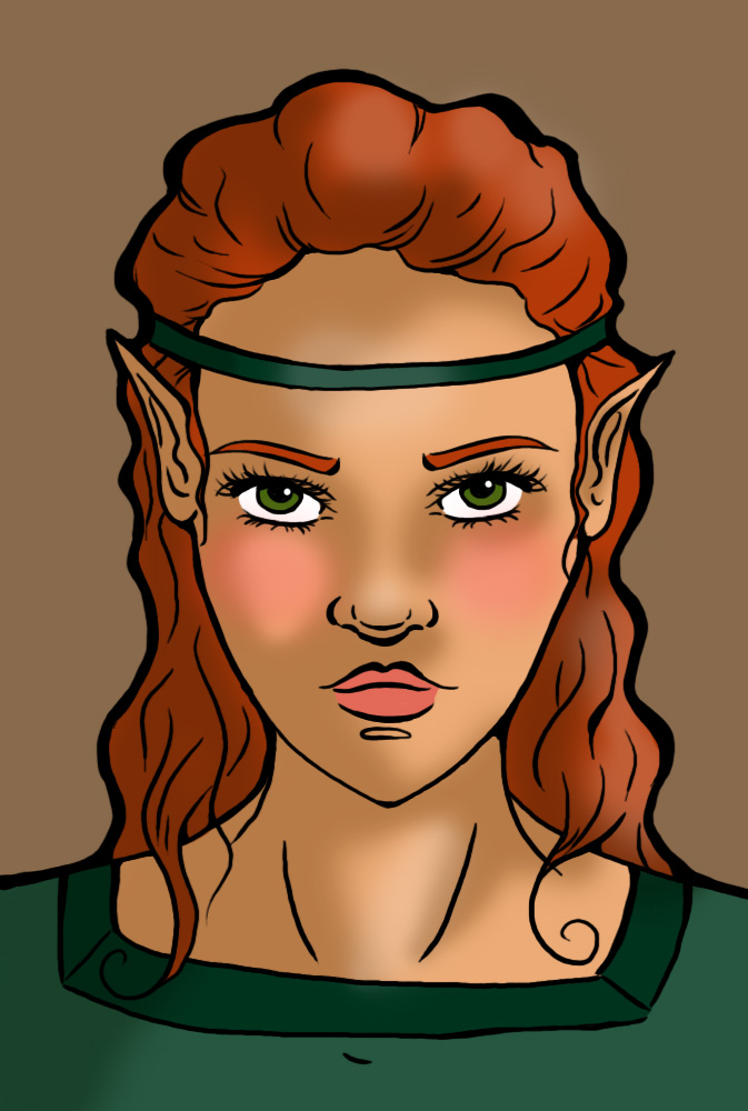
2. Smudge, smudge, smudge. Oh, yes, the smudge tool is your best friend if you want to do smother shadows and highlights. Those big, soft brushes are well and good, but the smudge tool, oh, that’s something else (better) entirely!
Now, as I said, we start with the same hard colours for this one. Take a large, soft brush, say this one
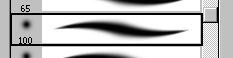
(Or even bigger!)
And do some large, soft shadows, like this:

(Click for larger)
I even added some highlights and roses to the cheeks, using the same brush.
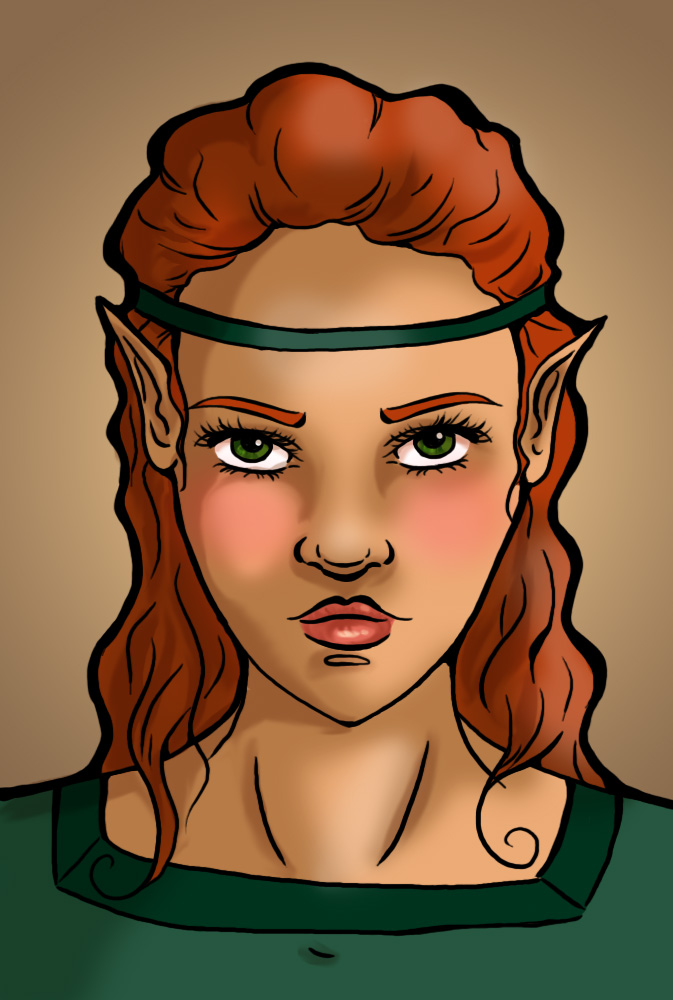
Now, you need harder shadows again. So to the same as you did with the cell-shading, only be sure to keep your shadows on the already shaded area, like this:
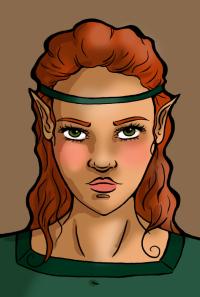
(Click for larger)
And now d’you know what you do? You smudge those hard lines to your heart’s content. Make some of them super soft, while keeping some edges harder, depending on how the light falls and how the shadow should be. Your end result might look something like this (but should look better, since I spent absolutely zero time on this >.>)
(Click for larger)
And the shading, smudging thing is something you can really keep doing forever, and you can smudge highlights, and you can smudge anything and everything. You should smudge anything and everything! :D Well, maybe not, but it really is the most wonderful tool you’ll ever come by. And you can smudge the lines too, if you want. They don’t have to be hard and crisp, just because I like them that way <.<
But yeah, now to the very final part. Aptly called
Tweaking
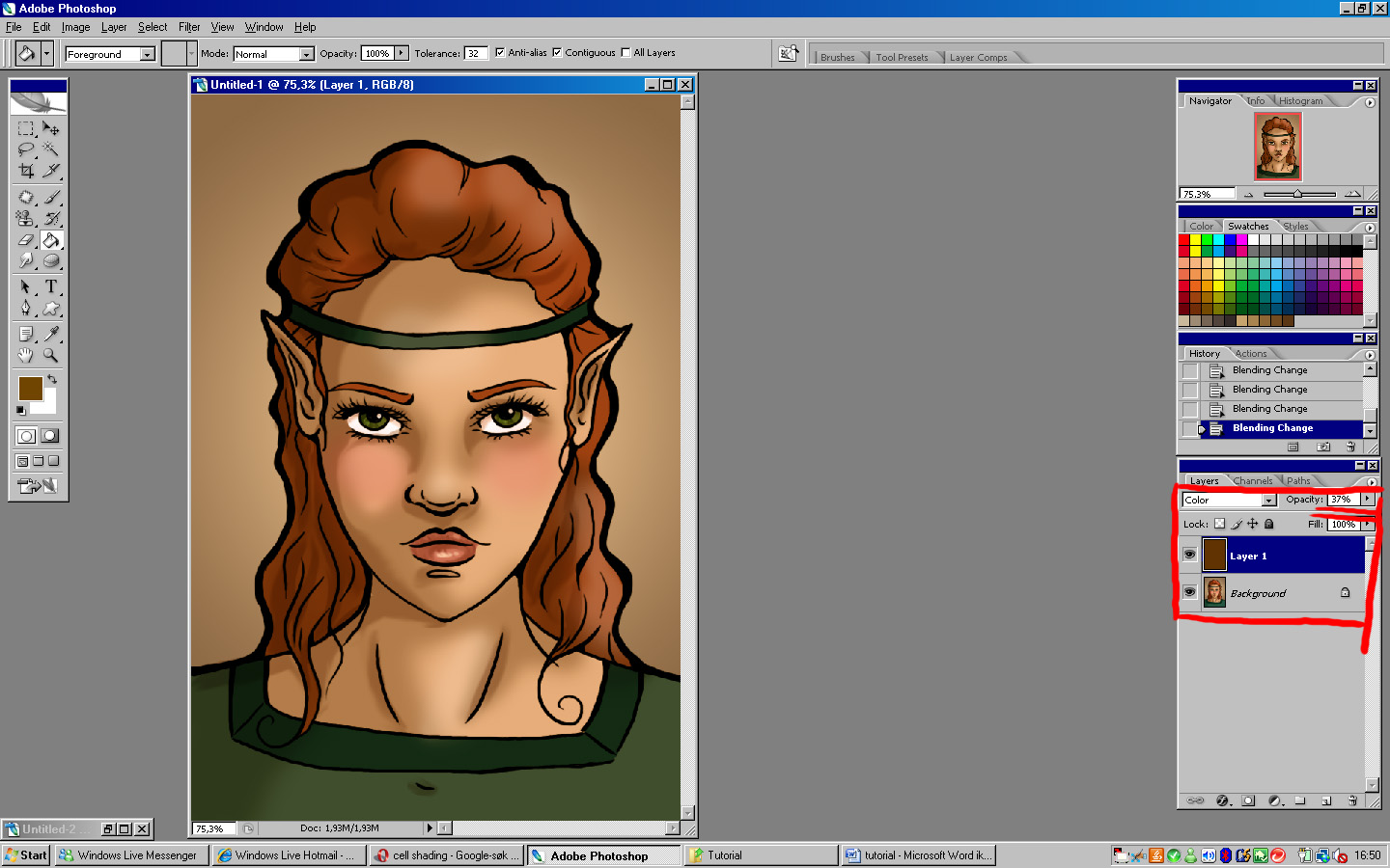
And this is the really fun part :D Now you flatten your picture, and you do fun stuff with it. For example, if you duplicate the image, you can change the colours and darkness and such by using overlay, multiply, screen, or any of the other wonderful things from this list:
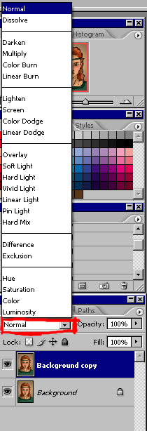
Some examples:
Overlay
(Click for larger)
Multiply
Screen

Of course, these are rather over the top, lowering the opacity will help with that.
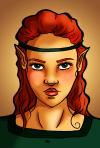
You can also add a layer of colour over your picture, and play with the same list. Again, lowering the opacity is a always good.
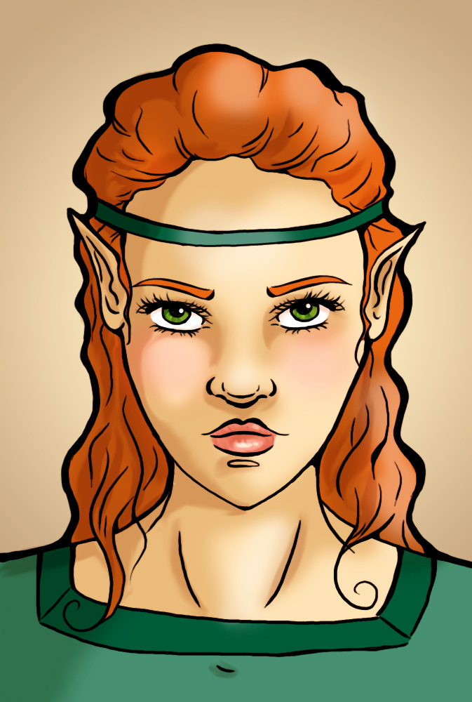
Here we have
(Click for larger)
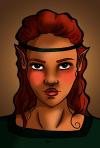
Another thing that is complete and utter love, is textures. Borrow them off some free stock, or make your own, either way, find yourself some textures and play with them!
Here, for example, I’ve taken this picture:
http://teeth-man.deviantart.com/art/old-crackly-parchment-texture-62016461
(All credit where credit is due)
And put it on a layer above the girl I’ve drawn, put it on hard light, lowered the opacity to 50, and voilà:
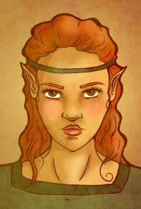
(Click for larger)
So you see, there is loads of fun to bed had, images to be tweaked, textures to be played with, etc. etc. Get out there and experiment! I won’t tell you again >:|
The End.
 Stumble!