Page name:
How to Draw a Portrait [Logged in view]
[RSS] 2005-06-21 02:52:40
|
# of watchers: 10
|
Fans: 0
| D20: 17 |


 Written by - [Asrun]

First step:
Guidelines

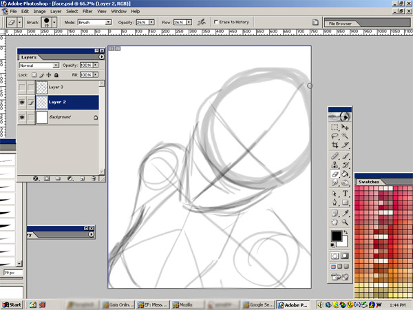
When drawing a portrait, fantasy, manga, realistic or otherwise, proper proportion is important. Only when you know the anatomic stucture of the face, will you be able to properly distort it, without people going "WTF...". Now, as you can see here, I have a bunch of working lines. On the face I have the center line, the nose line, the mouth line, and the eye line. That big circle, that's the crainial mass. Make sure you don't skimp out on that, otherwise it'll look like there's no room for a brain. On the other hand, make it too big and you'll have a conehead.
Planning like this will help you to not only plan out your face, but also COMPOSITION. Composition is important. It can change a simplistic drawing into something with dynamics. Hey, there's an idea for another tutorial... Anyways..

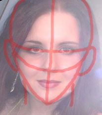
Taking this image of.. *cough*me*coug
h* you can see that on average, the face is fairly symetrical. Mine isn't the perfact example of this, but moving on..

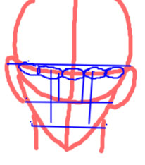
Here, we've taken those red lines, and remove the photo of myself. Now, you can see the proportion. Things to remember!
Our face, realistically is about 5 eyes across. From the pupils of our eyes straight down is wear our mouth ends (this changes of course with expression). The bottom of our noseis where our ears end and the top of the eyes is were they start. The inner corner of our eyes, straight down is where our nostrils are at their widest point. The bottom lip of our mouth shows where our jaw line is the widest.
These of course change slightly depending on how symetrical we are. There are people with large eyes, small mouths, big noses, etc. Alter these accordingly. :)

Second Step: Adding Features

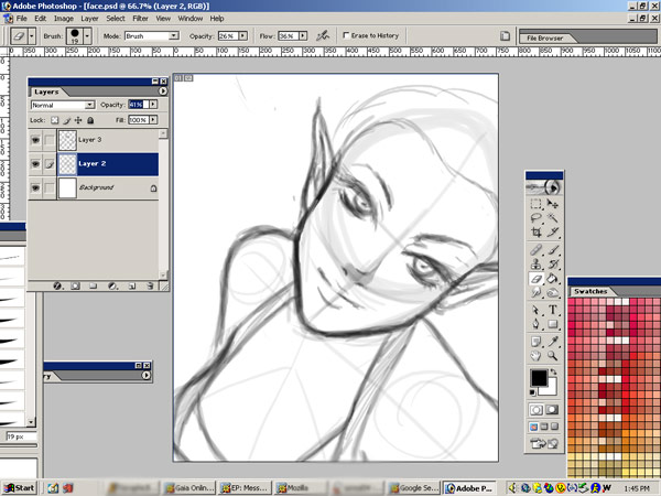
Now you see, I've begun to add in my details roughly.. As well as a hair line, so that I can see where I want the hair to fall. Notice that her eyes are bigger than 5 across? That's an alteration I've made on purpose, since this is my own style of manga fused fantasy. Like I said, you can alter proportion, once you understand it. ;)
Since this face is on an angle, I've angled all of my guide lines and rough features to match that.. You wouldn't want straight on features angled on a rotated face, now would you? Don't answer that.

Third Step: Defining Features and Adding Details

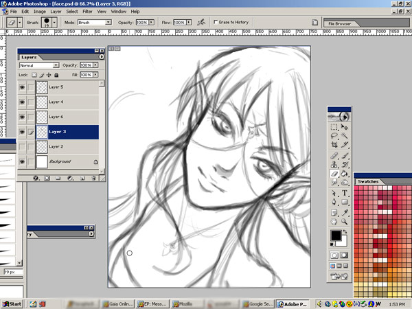
I've now begun to really define the her features and add in other elements such as clothing, hair, jewelry, etc. I've now removed the guidelines, since to my eye, she looks proportioned.

Forth Step: Finished Sketch

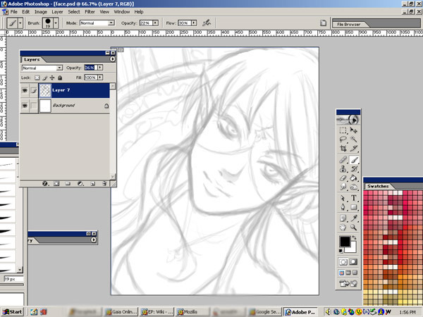
Here, I've defined her face even more, and have done a lot of clean up. She is now ready to be inked and coloured. :) Notice how she is lighter? I've fixed the opacity to about 30% or so, so that I can ink right away!

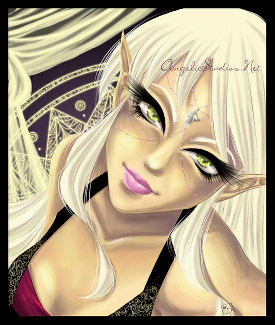
And, here she is after that.
| Show these comments on your site |
 Stumble!
