| Entrance | Mainstreet | Wiki | Register |
|
# of watchers: 18
| D20: 1 |
| Wiki-page rating |  Stumble! Stumble! |
| Informative: | 0 |
| Artistic: | 10 |
| Funny-rating: | 10 |
| Friendly: | 0 |
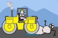
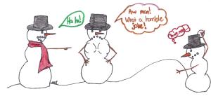

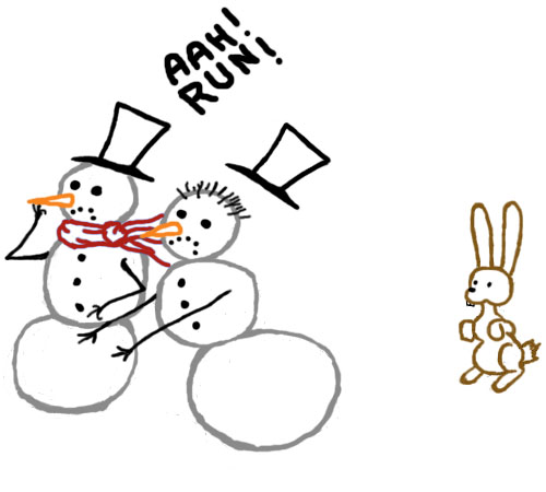

2008-09-20 [Nocturnaliss]: Which makes him scarier! Look at his face of ebil. XD
2008-09-20 [Hendercrazy]: If you wish to do multiples... that's fine by me! The more the merrier. Thou... I'd love to see you keep the original one up as well. :)
2008-09-20 [deeterhi]: I'd rather not leave up the other one though ^^ That's why I drew a new one :)
2008-09-20 [Hendercrazy]: *tears up missing the first one* XD :P ;)
2008-09-20 [Nocturnaliss]: ... but the other one was so cool. ;____;
2008-09-21 [deeterhi]: okay okay. I'll put the other one back up, but I'm gonna first tweak the colors a bit since I wasn't too happy with them.
2008-09-21 [Yncke]: Yay! I laughed hard with the first one too! ;)
2008-09-23 [deeterhi]: ooh less than a week left. I can't wait to see what everyone else does.
2008-09-26 [Hendercrazy]: Three days left! Still working on mine. I'll be a last minute poster. :P
2008-09-26 [Paul Doyle]: I'm afraid I'm not going to make the deadline. Far too much real-life stuff happening, of late :/
2008-09-26 [Nocturnaliss]: I don't think I'll have time to color mine, since color and I aren't good friends << XD so... black & white it is (also, yes, I know there are many errors of perspective and suches :3;).
2008-09-27 [deeterhi]: heheh, that's cute [Nocturnaliss] :) I wonder which is the endangered species :)
2008-09-27 [Nocturnaliss]: Thank you XD and, that's the idea.
2008-09-28 [Yncke]: Another one's coming too...
Edit: The drawbridge one is more for sillyness than for real. :)
2008-09-28 [Hendercrazy]: Awesome to see folks posting! :D
Does anyone want more time? Since we only have a few contributers..
2008-09-29 [Hendercrazy]: I went ahead and posted what I had to meet the deadline... but I'm still going to go back and finish it later. :)
If anyone wants more time... deadline will be the end of Monday. Then we'll begin our discussion on the cartoons thereafter. :)
2008-09-29 [Yncke]: Okay, I'll see if I can clear up the drawbridge this evening. No promises. :)
2008-09-29 [windowframe]: Can I jump in at a different point? I really love this idea, but I just don't have a single idea for a one-panel cartoon. ._.
2008-09-30 [Hendercrazy]: Sure thing [windowframe]. :) What comic stuff interests you? Comic strips? Web comics? Comic book pages? I just started off with single panel cartoons since it'd be quicker to start and get folks involved.
2008-09-30 [Hendercrazy]: Alright! :) It appears that all of the entries for Cartoon #1 are now officially in... so it's time to chime-in on all of the cartoons. ;)
Please keep it clean and constructive. Anyone can grade the comics. Just be sure to grade ALL of them please if you do! Keeps it fair for all contributors! :D
2008-09-30 [Hendercrazy]:
[deeterhi]
First comic.
Punchline: A-
Use of Subject Matter: A
Complimentary Artwork: A+
Final Grade: A
Comments: I loved the idea of a chess championship! :) The reaction of the dragon losing is quite funny. The reaction of the dragon in the background is priceless! XD Maybe this should've been in the forefront? This has everything to do with dragons too. The artwork supports the punchline and brings a wonderful atmosphere. :D Color takes this one over the top. Great job!
Second comic.
Punchline: B+
Use of Subject Matter: A
Complimentary Artwork: B
Final Grade: B+
Comments: The baby dragon playing with it's food is good stuff. XD The artwork once again is very nice! Great style. :) Showing more of the scene (and the mother dragon) might have given this one a chance to bring even more punch to the punchline and overall comic? Good job.
[Nocturnaliss]
Punchline: B+
Use of Subject Matter: B
Complimentary Artwork: C+
Final Grade: B-
Comments: The idea is funny and makes you think too! :) :P The lettering in the signs were a little hard to read. Making them more legible would really help out the delivery of the punchline more. ;) It's very artful overall. A slightly different angle of this scene would likely bring the overall comic out more (instead of the straight-on shot) as well as the subject matter. Good job!
[Yncke]
First comic.
Punchline: C
Use of Subject Matter: C-
Complimentary Artwork: B
Final Grade: C
Comments: The artwork stands out the most here. Lovely castle design! :D While the punchline of the cartoon is funny... it versus the actual subject matter doesn't overall relate. Especially since you had to tell us dragons were on the flags. The comic needs to be able to speak for itself. Perhaps if there were some dragons in the courtyard this would've had some better punch? This one had great effort... just needs work on the selling of the punchline and making it more clear cut. Nice effort. :)
Second comic.
Punchline: B-
Use of Subject Matter: C-
Complimentary Artwork: B+
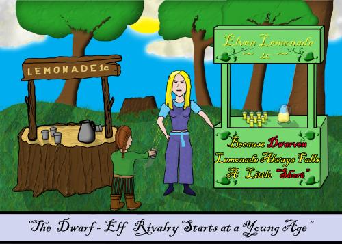
Final Grade: B-/C+
Comments: Really good art. :) The punchline is pretty darn funny after doing the math (Dwarf + big frickin' battle axe + ladder = Dragon head chopper offer). :P The selling point being the ladder and the ridiculousness of him using it. XD Just not sure how many folks will do the math to really get it. Perhaps having him stand in between two serious, taller, obviously more experienced and heavily armored dragonslayers would amp this one up a notch or two? Good work though. The thinking on this one is good. The delivery needs more umph. :)
| Show these comments on your site |
|
Elftown - Wiki, forums, community and friendship.
|