I would not really call this a "tutorial" because it's not a description of techniques or definitive method precisely. It's more like sharing the ways I have found to be effective, and a few Techniques I have stumbled on purly by making a mess of my paintings. I will do most of the lessons one on one in pms. cause people are at diffent levels :D
Taught By:[Ulaan]

Students:
1.[
Daemeon Arkenyon Zane]
2.[
NeverScape]
3.[
Astra]
4.[
raza]
Brief Outline:
1. The Basics
2. Background
3. Skin
4. Techniques
The Basics
First of all, if you haven't used watercolour before you need to find some
watercolour paper and paint that you feel comfortable with. Because some papers will be easier than others. Also, you need to think about
Brushes and paint, the beginner's mistake is always ... too many paints. Too many paints!.
I begin by taping down the borders with masking tape... or if your really flashy, artist tape. This just allows for easy handling of the painting and not having to worry about banged up corners. Also if you use thinner paper, this will prevent warping. Then draw out you picture. Befor you start painting you might want to you masking fluid on the bits you are not painting, BUT be carful if useing hot press watercolour paper!!! It will tear it!
A painting filled with carefully laboured detail from one edge to the other can be difficult to look at. If you like to work with fine detail, consider including some areas of relief. Also try to avoid neatve areas. This means no block colours, Also no black, try to avoid it. It makes all paints look muddy. It is more effective to use sepia for warm or woody picturs, or a prussian blue for cold pitures. But remember not to much or it will look flat and wrong.
Then the painting begins!
Background
Always start with the background, Then you can build on it and get neater lines. Start with washes filling in the big areas. I always personally make it darker around the edges of the person or thing in the for ground, this will make it stand out. Also if you want the weight to be at the bottom of the painting make it darker there, same for the top. Dont try to do it all in one layer, put down a base colour first, then add another and an other until you get the desired effect. The best way is to have gradiants of color, and to slowly build it up with thin washes; you have better control over it that way. If you are after a more textured look, then more pigment and a wet-on-wet approach might be more suitable. Between each layer of wash that I put on, I wait for the previous layer to dry! This is important, or else the colors just lift and you don't get the intensifying of added layers. It is especially imporant to wait for the layers to dry when starting to work on adjacent areas. If you get too impatient, the colors will all bleed together, and you are left with no definition. While that might be desireable for some styles or for a specific effect. Its the same with landscapes, start farthist back and build up, putting the details on last with a smaller brush.
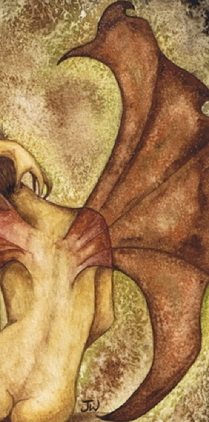
Skin
Skin is hard to get the right colour, but the basic principle is the same as the background, it's all in layers, paying attention to the shades areas. You couldn mix naples yellow with some oranges and reds and get some skin tones. If you wanted a bit unearthly, so it will be slightly green-tinged with a touch of sap green as well. If you were working with darker skin, various types of browns added to the mix would work well. I personally use....
After the underlayer for for the skin is dried, start to build up the shadows. With the smallest brushes (size 1 or 0), work from the edges of the body with mixtures of burnt umber or sepia. Shade in to define the muscles, and along the creases where the folds of cloth meet her flesh.
Example on skin

Techniques
Wet on wet : Wet the paper Befor Adding the wet Paint
Wet on Dry : There are 2 ways to Do this, But we will cover this later. The Basics are that you put one layer of paint on wait for it to dry and put anouther on.
Washes
Fig.1 Fig.2
Fig.2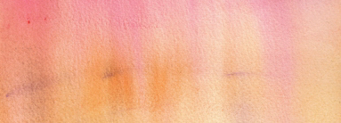
The most basic watercolour technique is the flat wash (Fig1.) It is produced by first wetting the area of paper to be covered by the wash, then mixing paint to the area. Then the wash should be left to dry and even itself out - don't be tempted to work back into a drying wash, the results are usually disastrous!
You could also try it a different way. This technique requires the paint to be diluted slightly with more water for each stroke or you could add in a diffent colour. The result is a wash that fades out gradually and evenly as shown above in Fig.2. It might help to turn the paper upside down to help the colour run.
Textures:
Salt:

By adding salt to wet water colour it can creat a texture. If the paint is really wet you will get a bigger affect as t sokes up the water and paint. Like in the background of the picture above. But if it is only a little wet it will be diffrent. You wil have to practice with it to find what effect you like the best. It also depends on what type of salt you use. Fine table salt will make it more fine, like on the wing on the picture about, while rock salt will take up more.
Dabbing:

By dabbing the watercolour it will take of some of the paint
...as you would exepect, but this can creat a nice effect. Especally if you having trouble making a even background, or can mix the colours to well. It softens it also. Dabbing with paper towels while it's still wet will remove some of the colour and leave the area slightly lighter. I use older brushes that have lost their point for this because it's not very friendly for the hairs.
Plastic Wrap:
Fig.3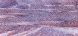 Fig.4
Fig.4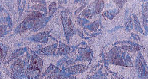
This is an interesting way to texture mountains, ice or water (Fig.3) Stretch the plastic wrap sideways, forming folds, then lay into a wet wash. Allow to dry, then remove. Or try the plastic crumpled and lay into a wet wash, where it is allowed to remain until the wash has dried.(Fig.4)
I made a little glossary for you all! You lucky things.
Glossary of Painting tearms
 Back to art or elftown academy
 Stumble!