TUTORIAL 1: PORTRETTING
================================
Chapter I: Finding a model.
__________________________
If you want to draw portrets you'll need a model, otherwise it wouldn't be a portret. You can work with a life model or just a photo, I prefer to work with photo's of the wanted person in the wanted pose. If noone is willing to be your life model or you don't have any useable pictures, try browsing the net. I mostly get my models from sites of men's/women's magazines, fashion magazines, hell you can even just type "models +pics" into your google search bar.
If you can't find anything there that you like, you can always extend your search to the "naugthy sites" for if you need nude models or whatever.
Here is a picture of the model i'll be using in this particular tutorial.
====> http://img2.uploadimages.net/6092081.0.the_model.jpg <==== it might not show the first time so you'll have to use the "refresh" button in your toolbar
Chapter II: The equipment.
__________________________
pencils:
I only got five type of pencils B1, B2, 2B, 3B and a mechanical pencil HB.
For drawing the sketch and the refined sketch i exclusively use my HB mechanical pencil. I advise HB pencils, cuz H is too light and B+ is to dark (it is at least for the sketching). HB is also easy to erase and they don't scratch your paper like the harder H pencils do.
paper:
the thickness of the paper you should use, depends on your technique and on how good you are. If you're gonna use a lot of layers or when you plan to smudge or erase your stuff a hundred times, i would suggest thick paper.
I myself, mostly use ordinary printing-paper or some cheap drawing paper from my stash (i bought the stash in a cheap store where they were selling it by an even cheaper promotion prize, hihi)
erasers:
man i'm just an ordinay guy like you, so i don't got any of the fancy stuff they promoted in the real tutorials. My eraser is just a standard white square, wait i'll upload a photo.
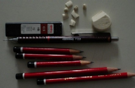 About my eraser, like you can see i've cut one edge off with my samurai-sword. I did that to sharpen the edge so i would be able to erase very fine lines, that's also the reason i use those real tiny pieces of eraser.
Chapter III: Time to cut the crap and to get started.
_____________________________________________
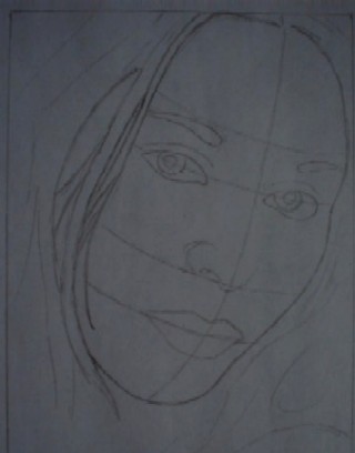
The first thing we got to do is get a raw sketch of the model onto the drawingpaper. Off course this is easier said then done. The important thing in this stage is drawing the proportions of the model accurately.
It's not the time yet for detials, right now we need to focus on the proportions of the face.
If you have trouble doing this right, you can use "THE GRID".
This means we'll devide the photo of the model into 16 equal squares(4x4) (or more, whatever you need). Do the same with the paper you are drawing on. Now look at one of the squares on the model and draw it's contents in the corresponding square on your drawingpaper. It is much easier to draw little pieces at once (like the contents of one square). This way, it's easier to get the proportions how they should be. If you still fail to do it right, try using more squares. Don’t forget to look at how the whole drawing is coming, cuz focussing TOO MUCH on the little squares isn’t good either.
If this is hard to get/visualise, vieuw this link
http://img2.uploadimages.net/show.php?img=6398601.1.the_model.proportions.jpg
 now that we've got the proportions right, you can erase all unnecessary lines, like "THE GRID" and other aid lines.
Chapter IV: The eyes.
______________________
So now let's get started with the real thing. I always start with the refining of the eyes. Doing the eyes first, is like giving the drawing it's character. The kind of eyes you have givin the person will determine the atmosphere and that's important for when you're doing the shading. (dark, spooky eyes need dark shading, etc.)
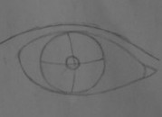
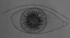
First of all we need to study the eyes, understand how they are build. I'll use the picture on the link below to explain the whole thing.
vieuw the eye on the right (on this drawing)
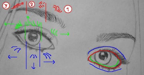
THE SHAPE OF THE EYE:
Now look at the RED lines in the picture, they are outlines. They go around all the way and determine the shape of the eye. The GREEN line is the inside of the lower-eyelid. Note that the green line includes the corner of the eye (that's where all that greacy stuff is in the morning)
The BLUE lines are NO contourlines, they are just skinfolds so they don't go around nor close in any common point.
So we got 3 lines in the lower section of the eye and 2 lines at the top.
THE IRIS:
When a person looks directly at you, the lower part of the iris is fully round and always touches the GREEN line. If the person was to look down, the lower part wouldn't be fully round but a segment would be cut off.
The round upper part of the iris is always cut off by the upper eyelid (unless the person has his eyes wide open, wich is not a common pose for portrets).
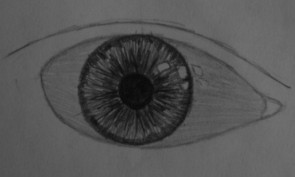
When you study your own eye, it will seem like it exsists of multiple layers. Here’s a photo of my eye. Btw the word ‘iris’ comes from greek mythology, in which Iris is the personification of the rainbow.
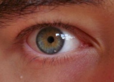 i apperently have a blue underlayer and a brown upperlayer
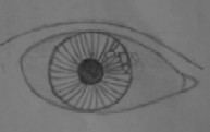
Someone else’s eye
i apperently have a blue underlayer and a brown upperlayer
Someone else’s eye This looks really complex. I’m not gonna explain how you can draw this, partially because this tutorial is for beginners but mainly because you never have to draw in such close-up when you draw portrets. So we’ll just stick to the pic of my eye for the explanation.
Scientific explanation about the iris:http://en.wikipedia.org/wiki/Iris_of_the_eye
This looks really complex. I’m not gonna explain how you can draw this, partially because this tutorial is for beginners but mainly because you never have to draw in such close-up when you draw portrets. So we’ll just stick to the pic of my eye for the explanation.
Scientific explanation about the iris:http://en.wikipedia.org/wiki/Iris_of_the_eye
When I draw irises, I start with the underlayer then the upperlayer and finish with the edges. When we closely look at the iris, it’s like fine lines of pigment lay right next to each other, making a complete, perfect circle.
The iris itself isn’t flat, so we have to draw the lines a little round. Don’t forget to draw the white reflecting parts on the eye before you draw the fine lines, unless you don’t mind erasing them afterwards (like I did).
THE UNDERLAYER:
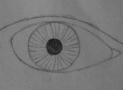
the number of lines added in the last step, will determine how dark the iris will look.
THE UPPERLAYER:
Use a slight more darker pencil to do the upperlayer
THE EDGES:
Add the edges and darken the pupil.
 now vieuw this pic for the explanation on the lashes and eyebrows.
http://elftown.eu/img/photo/154339_1125065725.jpg?
OR VIEUW THE EYE ON THE LEFT ON MY DRAWING ABOVE.
UPPER LASHES: (in green):
They are standard devide into 3 part. Part one: where the lashes curl up to the right, part two: is a transite part and part three: where they curl up to the left. More towards left outside, the lashes will lie more horizontally (as indicated on the picture)
LOWER LASHES: (in blue)
They show the same "curling-patte
rn" as the upper but now downwards offcourse. The number-one big difference between the upper and lower lashes, is that the lower are less in number and they seem to be hanging together in small groups. Check out your own eyes to confirm.
EYEBROWS: (in red)
Now the picture shows that there are three parts, but this isn't standard, mostly it's only part one and three. The second part can be seen on women who epilate their eyebrows. Look at the picture or drawing to see how the individual eyebrows bend.
Now let's draw what we have so far ok. For this part it's very imortant that you use a super-sharp pencil or mechanical pencil, cuz these lines NEED to be real FINE.
If you can't get the stuff in this chapter right from the first time, don't give up. Feel free to fail as many times you want. There must be room for failure otherwise you'll never get better. Every failure is one step closer to getting it perfectly right. cuz if you stop failing, it means you got it just the way it needs to be.
Note that although we may be using a model, that doesn't mean our drawing needs to be a perfect copy of the model (if i wanted a copy, why bother and not just slide her under a copymachine). If you can't get it right immediatly, don't pin yourself down on the details, it is just a model. I still remember my first portret, it looked nothing like the model i used. I'm just saying don't be to hard on yourself if you're just a starting artist. It will come in time. All you need is a good tutorial to get you started
I also got another eye-drawing in my elfwoodgallery that you can use as an example.
http://elfwood.lysator.liu.se/art/a/l/alchemist/sz1portaitcloseupeyes.jpg.html
Chapter V: lips.
_________________
Just like the eyes we’ll first study the shape of the mouth. I’ll be doing the explanation for normal lips, by that I mean: closed mouth, slightly smiling, not disfigured, …
Or vieuw this link to see it on the model.
http://elftown.eu/img/drawing/154339_1125939123.jpg
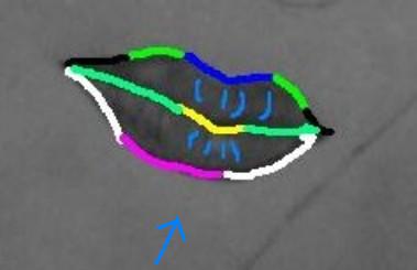
(hollow or convex is vieuwed in the direction of the arrow.)
UPPER LIP:
First there is offcourse the standard V-shape (in blue), positioned directly under the center of the nose. Both left and right of the V-shape, the lips take a hollow shape (in green). Then there are the black outflowing lines. In this case the left is hollow and the right is convex, now this is the part that isn’t standard. Sometimes they’re both hollow or both convex etc. This has much to do with the person itself and wether he/she is looking to the left, right or straight at you.
Between the two lips we can find the mouthopening, wich is now closed so it exists of only one line. Again there is a standard V-shape (yellow)(less sharp then before) and outflowing lines at both sides.
LOWER LIP:
The lowest part is round (purple). The outflowing lines are either convex, hollow or just one round line. This is STANDARDLY determined by wether the person looks right , left or straight at you.
Our model looks slightly to the right so the right outflow is convex and the left is hollow.
STRUCTURE:
The lips exist of tissue that has quiet a lot of wrinkles. Because of the fact that lips are a little round, it will seem like the wrinkles curl a bit towards the mouthopening. The “curling-pattern” is the same as the lashes (see the light blue lines). Again it’s devided into three parts: 1)up/down to the right, 2) transite part, 3) up/down to the left.
SHADING:
ALWAYS LAY A SHEET OF PAPER BELOW YOUR WRIST/ HANDPALM TO PREVENT SMUDGING
Totally depends on the direction of the light. When the light falls in from the front, it’s the center part of the lower lip and the top of the (blue) V-shape that are reflecting the light and therefore seem white or less dark then the rest. (No need to scientificly explain why it’s these parts reflect the most light, just believe me when I say that they do). With light falling in under a strong angle to the right or left, it’s the outflowing parts that reflect the light.
In our case the light falls in from our left so the left outflow will reflect the light.
Ok so we begin the shading with a basic layer, here you determine how dark your lightest parts of the lips will be (excluded the white reflecting parts, for that we’ll use the small pieces of eraser I mentioned earlier). I mostly do three layers. The second layer is to do the darkest parts and the third layer is to mix the light and dark parts into one fluid whole, so that the transition from light to dark isn’t to abrupt or gives too much contrast. The last step is erasing the reflecting parts.
Oh yea try to do the shading in the same direction as the wrinkles, the wrinkles run vertical don’t do the shading horizontal. Shading aids in how the structure of the tissue/surface will look. For example if you have shading on a brik wall, you don’t want to be doing the shading with your hand making circular moves. Do the shading in the same direction as the direction of the fibres in the surface that you’re shading.
For the first layer it doesn’t really matter in what direction you shade, it’s just a basic layer. But still we want this basic layer to be smooth. I’ll be making the surface smooth by using the “4-DIRECTION RULE”. By shading in four directions, you’ll create a very fine maze wich will work as an optic illusion for your eye so that it will seem as if it’s a fine, smooth surface.
The following pic will clearly show this effect . (don’t mind the quality of the last 2 pics)
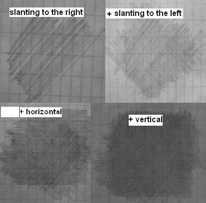
if you want it ultra-smooth try making circular/oval moves in the 4 directions instead of lines. After layer two and three you can add the curling stripes of the wrinkles and erase the refllecting parts.
All right let’s get that on our drawingpaper.
Again I want to mention that it’s not that big a deal if you can’t get it right immediately. I had to erase the whole mouth two times and do it all over again, so…
Chapter VI: The nose.
______________________
In this stage there isn’t much to it. All you can do now is the top of the nose, the wings of the nose and the nostrils. The relief of the brigde of the nose is done with shading. Not much I can say about it, all depends on the perspective and from what side you vieuw the nose. So, just… euh… draw it.
Chapter VII: Accesories.
________________________
This is the time to draw all the accessories. Glasses, piercings, horns, vampireteeth, futuristic helmets, x-ray vision, eye-equipment, breath masks,…etc. you name it.
When this drawing is finished I want to upload it to my elfwood gallery. Now they have strict rules on what is considered fantasy & SF and what is not. So this is the stage in wich I’ll be adding all the stuff that will make the drawing look fantasy or SF.
We first start with designing the wanted equipment in a sketchbook or on rondom paper. After I designed all the stuff I could come up with, I slided my real drawing under a copymachine. Then I draw the equipment I designed on the copy, this way I won’t be spoiling my real drawing if anything went wrong.
Now I’ve drawn way to much stuff on this copy and not everything seemed suitable for my pic so I had to let go of some things and decide what I really want to go with my drawing.
After i’ve made up my mind, i can draw the equipment onto my real drawing.
I drew some pearls in the hair, a blaster and some armor plating.
Chapter VIII: Hair.
___________________
Not much hair left to draw , so I’m not gonna write this chapter (at least for now). I think my second tutorial is gonna invole some more hair. Meanwhile you can vieuw this link to aid you at drawing hair.
http://elfwood.lysator.liu.se/farp/theart/maeryhair/maeryhair.html
Chapter IX: The shading.
_________________________
Now this is my favourite part. Allthoug it takes the most time and is the hardest thing to do.
I finished the first six chapters in about an hour at maximum, but this chapter is gonna take me quiet a bit longer. But still I just love to do shading (and eyes).
Shift the shading in separate layers of darkness/brightness. If you have trouble doing this or you just haven’t developed ‘the feeling’ yet, you can always use a computerprogram to shift the brightness-tones (that’s how I started). Standard programs like “microsoft picture it”, “microsoft photo editor” will do the trick. For the first layer put the brightness in your pc-program to the maximum. This way only the darkest tones will ‘survive’.
This is also the stage where the different pencils drop in. So far I haven’t used any other pencil besides the mechanical one. I advise you to put a sheet of paper under your hand to prevent smudging.
I’ll place some photo’s here of each layer, i used “microsoft photo editor”.
First layer has brightness 90 (the zero line of neutral brightness is at brightness 50)
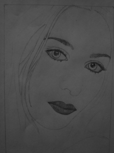
LAYER 1, brightness 90, pencils: H3
Like you can read, I started the shading with a H3 pencil. It’s good to start with a light pencil cuz when we add a new layer we’ll be going over the previous aswell. So unless you want the person to look like she/ he’s black, you better start light.
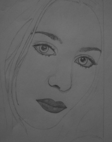
LAYER 2, brightness 75,pencils: H3, HB
So I added some shading around the eyes, lips and forehead. In this stage I did what I told you not to do: I made the shading too dark. What to do then, erase and start all over? NOPE, there’s an easy way to fix it. Instead of erasing the whole shading, take your eraser and just PRESS it on the areas that are too dark. The eraser will absorb some of the carbon from the pencil, making the drawing lighter
(there is no smudging this way) (By pressing harder you can adjuste the amount of carbon that is absorbed).
This also means that the surface of the eraser will become black with carbon so you can’t do it endlessly. If you keep pressing even after the eraser-surface has reached it’s saturation point, you’ll screw up your drawing cuz it will make stains and then you’ll have to start erasing for real. To make the eraser white again, just rub it over a sheet of paper, like you would if you were actually erasing something.
So now we’ve ‘pressed’ the second layer away and we’re back to layer one and voila you can do layer 2 again without having erased all layers.
Halfway the shading I always start thinking: ‘oh man, this ain’t gonna work out, it totally looks like crap’. If you look at the drawing, I must say she isn’t looking all too pretty, she looked better when we were only at layer 1. I always get the tendency to just give up at this point, cuz hey look at her, it seems like just went to the ‘Dark Side’ or something.
DON’T GIVE UP, if the drawing looks like crap it means you’re only one layer away from getting it finished. It looks crappy because you have some parts that are shaded and some are still white so there’s a big contrast of light and dark. The thing with contrast is, it will all look cool if the proportions of light & dark stay within certain borders. Once you take even a small step across that border, your drawing will go from cool to supercrappy. This explains why layer one looks better then layer two: the light & dark proportions of layer 1 still fall within the borders and by adding shading in layer 2 we crossed that border. So now we only need to shade the white parts to fix those dark & light proportions.
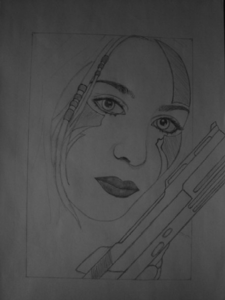
LAYER 3, adjust-the-light-and-dark-proportions-layer, pencils H3
I putted this layer on top of all the previous layers, over the nose, over the mouth, over the whole drawing exept the eyeballs and the metal plates. I used the 4-direction rule only for this layer and not the other layers. Why? Because the other layers don’t need to be smooth, I shade those layers in the direction of the skinfolds and according to the shape (meaning cheeks are shaded with a round motion) Shading according to from or shape of the particullar bodypart, will give the drawing the relief that is needed. If I did the cheeks with just straight lines, it would look like her face was flat. Now I used a round motion because the cheeks are a little convex.
Look how this layer has fixed most of the proportions of light and dark, still needs a little adjustement though
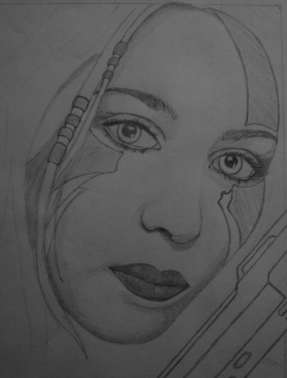
LAYER 4, touch-up-layer, brightness 50, pencils: B1, 2B.
In this layer we will do the same as in layer 2 but now with a B1 pencil. We also need to darken the eyelashes and eyebrows, I did this with a 2B pencil. If nessecairy erase the highlights (all reflecting parts on lips, eyes,…)
![<img:>]()
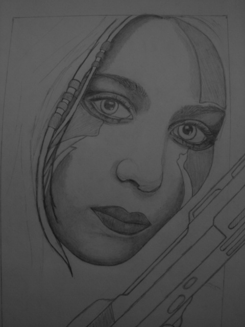
Chapter X: Finishing touch.
___________________________
all right folks we’ve come to the end of this tutorial, all we need to do now is the finishing touch. This means i’ll erase the places where i smudged, correct little flows, add some more shading if necessary , go over some lines again because i wiped them out with my hand, add small details, …
![<img:>]()
congratulations you have made it to the end of this tutorial. My intentions with this tutorial were that you guys would learn more about pencil portretting. I sincerely hope that I succeded in my goal.
If you made a drawing with the aid of this tutorial, I WOULD JUST LOVE TO SEE IT. Let me know if any of this was usefull to you. Also all tips on how I can improve this tutorial are welcome.
NOTE:
1. if you have positive or negative comments about the tutorial ITSELF !!!!!!!!,
pls put your message in the comment-area below.
2. if you just want to say thank you or say how much this has (not) helped you,
pls send it to the messagebox in my house. [The Alchemist]
RETURN TO tutorial for pencil drawings
I DON'T LIKE THIS STUFF, TAKE ME BACK TO The wiki´s wiki page
.
 Stumble!