| Entrance | Mainstreet | Wiki | Register |
|
# of watchers: 7
|
Fans: 0
| D20: 11 |
| Wiki-page rating |  Stumble! Stumble! |
| Informative: | 0 |
| Artistic: | 0 |
| Funny-rating: | 0 |
| Friendly: | 0 |
Previous:  | Up: pilgrim_archive | Next:  |
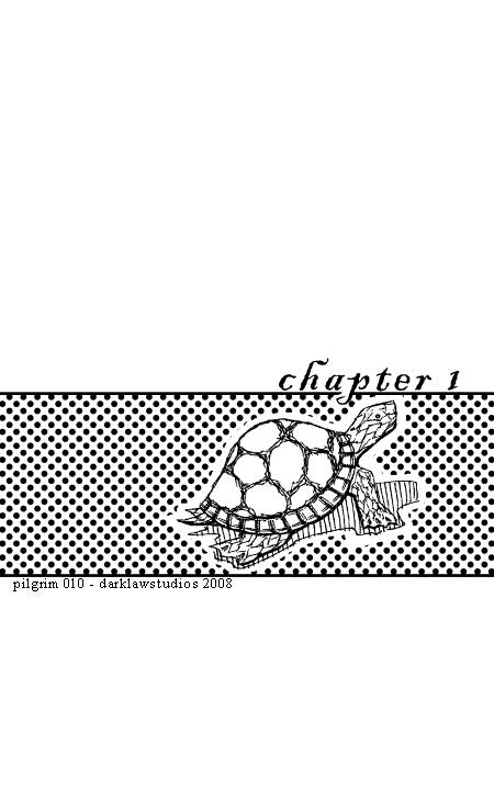
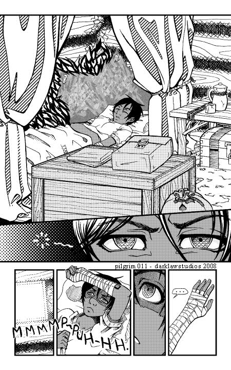
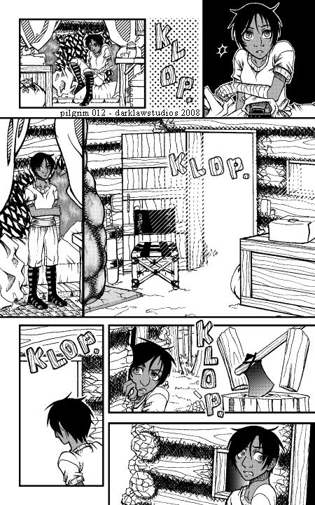
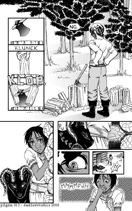
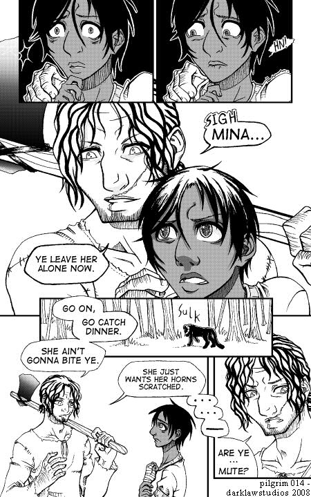
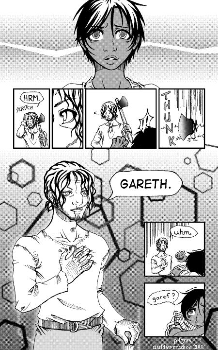
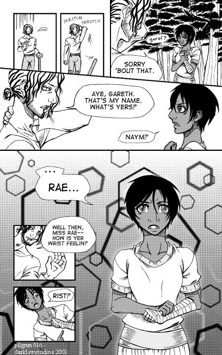
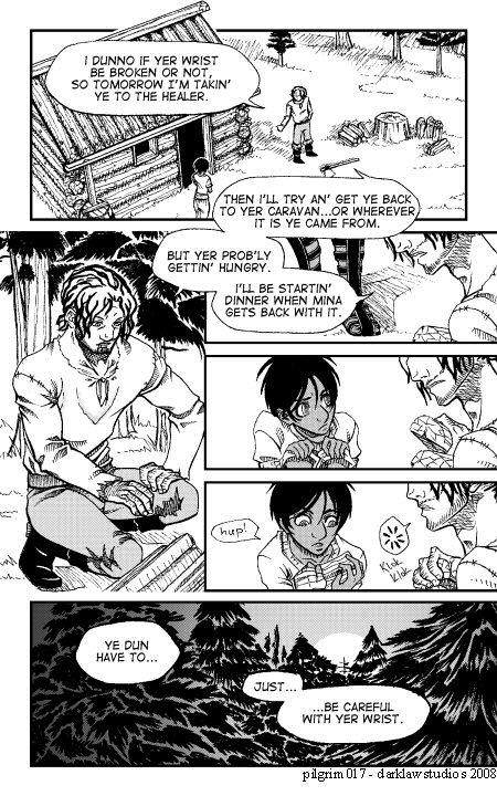
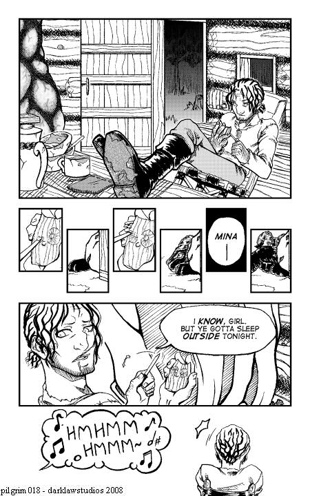
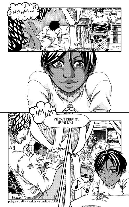
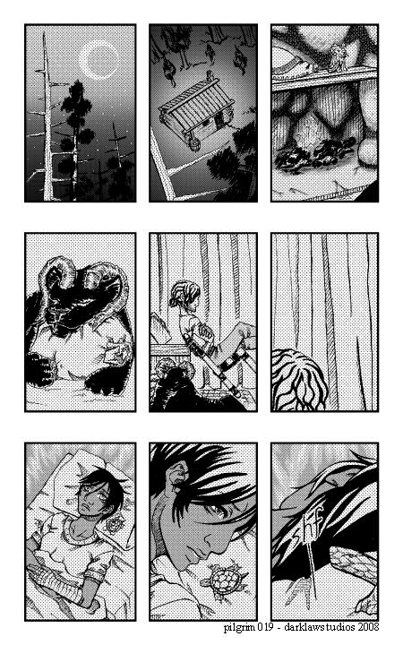
2008-09-02 [Zab]: Wheee!
2008-09-02 [stuffAEAmade]: There, added a bit more up top, to help out the Google ad in the exported version :)
2008-09-02 [Yncke]: That was a good read. I'm looking forward to the next chapter!
Little remark, though. Did you resize the images? Rasters aren't to happy with resizing...
2008-09-02 [stuffAEAmade]: They are sized down to 30% of the original and compressed a bit for web. Which does create the moire effect, if that's what you're refering to. :)
2008-09-02 [Yncke]: That's what I'm referring to indeed. :) Personally, I think the resizing isn't really necessary, on the contrary, it will benefit the artwork not to resize. :)
2008-09-02 [Dint]: Oh God, I'm dying to know more about these characters.
I too, will be looking forward to the future chapters!
2008-09-02 [Chimes]: I like it. :D
2008-09-02 [stuffAEAmade]: The full size is 5.25x8.25 inches at 300 dpi, can't quite post that. The tone is a dot pattern, which goes all grid-like on resize.
I can try the resize with just solid grey tones and see how that looks though. But not until the weekend. :)
@ Dint and Chimes- Thank you. I'll keep working on it was much as school allows. :D
2008-09-02 [Yncke]: *Grabs an inch to centimeter convertor* Naah. I like the grids. *grin* I was just nitpicking, because there's nothing else to remark to the comic. ;)
2008-09-02 [stuffAEAmade]: It's 1575x2475 pixels full size, for everyone else. ;P
ffffffttt, I'm sure there are tons of things that can be remarked upon. I'm pretty sure most of the interior perspectives are skewed one way or another.
At least I have my forest reference photos now, so the environment will start looking better. :3
2008-09-03 [Yncke]: With comics, it doesn't have to be correct, it has to work. And it does work!
2008-09-03 [deeterhi]: ooh, this is so awesome :) Love the characters and compositions. The design is much clearer than Chap. 0 which makes the story easier to follow. All around: top notch work :)
2008-09-04 [stuffAEAmade]: I'd still like for it to look correct though :PP
Yay! If each new batch of pages looks better than the rest I'll be content. :3
2008-09-04 [Zab]: The environment needs to look better? O_o;
*is too busy waiting for next chapter to notice*
2008-09-04 [stuffAEAmade]: Yes, right now it's just trees and generic grass when there should be a bigger variety of plants, ferns, wildflowers, moss in damp areas, etc. :B
2008-09-06 [Zab]: nah, it's nice^^
2008-09-06 [stuffAEAmade]: well in the future it's going to look nicer. :P
| Show these comments on your site |
|
Elftown - Wiki, forums, community and friendship.
|