| Entrance | Mainstreet | Wiki | Register |
|
# of watchers: 43
|
Fans: 0
| D20: 20 |
| Wiki-page rating |  Stumble! Stumble! |
| Informative: | 0 |
| Artistic: | 0 |
| Funny-rating: | 0 |
| Friendly: | 0 |


2010-04-02 [Hedda]: The friends only diary notes are now in a different colour.
2010-04-02 [Zab]: aw it changed back.. I got an idea/taste for a light brownish background with a slight tree trunk texture, going along with the vines and such..
2010-04-02 [Stephen]: Hm. Hopefully it goes back to the more toned down one again. xD
2010-04-02 [Zab]: Hm? It's back to the green for me..O__o
2010-04-02 [Stephen]: I mean the brown one. xD
2010-04-02 [Sauron]: YAY THE GREEN IS BACK!!!!!!!!
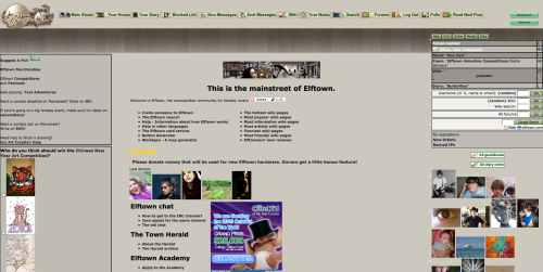
2010-04-02 [Evolution X]: that is a very long implimented april's fools joke... how long did it actually take to code those pages to look like that?
2010-04-02 [Calico Tiger]: A long time. Because it wasn't really a full April Fool's joke :) Elftown really is being reworked and redesigned. This was a great way to get some feedback on some of the parts :D
2010-04-02 [Chel.]: We are still working on it... please keep leaving feedback!
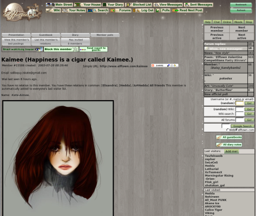
2010-04-02 [Evolution X]: Ok, well black on green is a quite distinct colour, easy to read and discern what's being written. If it's black on grey, if the computer does not have a very well lit screen, it might be difficult to see for some people... So if there is a colour change I'd suggest grey isn't too good. Just a suggestion really...
2010-04-02 [Chel.]: What would you suggest?
2010-04-02 [Evolution X]: I dunno... *scratches my head* I'm used to green... it's a neutralistic colour that doesn't make it difficult to read or hurt your eyes from staring at it for too long. Yellow and red would probably do that. Perhaps a blue colour? Can't be too dark or similar to the text... *shrugs*
2010-04-02 [Chel.]: I suppose I would be fine if the paneling was lightened to contrast the black more.
2010-04-02 [Azuri]: It needs to be finished up completely but I really liked it and think it would be great :)
2010-04-02 [Himura Kenji]: well if it was buggy, then okay, but it was still cool, I changed my house becuase of the new style, and I liked it. I hope it does become a permanent option later on!
2010-04-02 [Teufelsweib]: you can still use it as a stylesheet, explained above :D
2010-04-02 [Gypsy Mystik]: I love the Green BUT I love the coiver icon for the April background
2010-04-02 [Silver Moon]: I liked the ET icon too
2010-04-02 [pegasus1000]: I went to use the style sheet and here are my personal Pros, Cons, Suggestions
-The wood plank background could be a lighter gray so that the text on the pages could be read easier. Or the texture could be less outstanding, it was a little distracting. Bold text is easy to read, but not normal text.
- After spending some time on the site with the style sheet I found that my eyes had grown tired. While with the green I can read for hours without a problem.
+ I Really liked the color for the comment sections and in the homes. It was nice on my eyes.
- One problem I saw was when I was looking at the updated pages on the side bar, the blue was not easy to read and I almost missed it.
+The backgrounds for the daily poems and featured members. It was nice and made the text easy to read.
-Some of the older badges (Like my greateldar badge for poetry corner) would need to be updated so that the background would blend in to the new layout.
* If a new permanent style were to take over the green would you want to redo the green badges?
+ I liked the night time feel to the layout. The stars and new logo. I do agree that a side design would be needed. If I were to do the design I would try to meld the night time them with the forest them. A mixture of stars and vines perhaps.
* If you wanted to chose another color I would go with a light purple or a grayish purple.
I think that’s it. But on a side note when I switched back to green I had a shock to my eyes (It’s so bright!!)
2010-04-02 [Alexi Ice]: I like it, personally, except the color is a bit hard on my eyes.
| Show these comments on your site |
|
Elftown - Wiki, forums, community and friendship.
|