| Entrance | Mainstreet | Wiki | Register |
|
# of watchers: 43
|
Fans: 0
| D20: 20 |
| Wiki-page rating |  Stumble! Stumble! |
| Informative: | 0 |
| Artistic: | 0 |
| Funny-rating: | 0 |
| Friendly: | 0 |


2010-04-01 [Ramirez]: Fantastic! Makes all the color just pop. XD;;;
2010-04-01 [Keno]: It's cool :)
2010-04-01 [Chel.]: [popeyethecat] - What do you mean about it being sleek? Shouldn't that be a good thing?
I understand the darkness thing.
2010-04-01 [Stephen]: I like it. =)
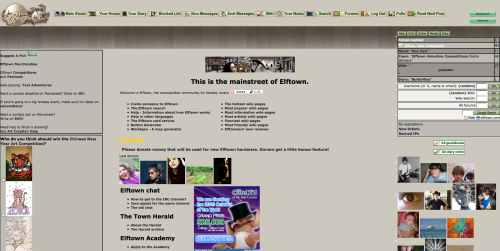
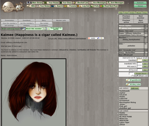
I find the darker color is more pleasing to the eyes, it makes text stand out better. Although, the grayish color on houses makes some of the lighter color donator tags hard to read, like the white on [Hedda]'s.
2010-04-01 [frogster]: Love it!! It is a welcomed change with great contrast for text. :D
2010-04-01 [Lothuriel]: I think it totally freakin' rox muh sox!!
2010-04-01 [Yncke]: I like the cleaned out right hand side. Perhaps the "All Guestbooks" and "All diary notes" can be unified too. Now they look a bit out of place.
And perhaps a good moment to PNGify the badges? :)
2010-04-01 [Himura Kenji]: I don't mind it! I kinda like it actually, change keeps things interesting.
2010-04-01 [nathie]: happy april fools day! :)
2010-04-01 [windowframe]: Aw bless, he thinks we're not serious. :3
2010-04-01 [KahanKiller]: i don't care for it :P
2010-04-01 [windowframe]: Any particular reason? Not a fan of the colours, is the text too hard to read, etc? What would make it better, in your opinion?
2010-04-01 [Forest Sage]: I love it!! ^_^
2010-04-01 [Titus (Cammy)]: The text isn't too hard to read, though the wooden floor boards make me feel like I'm trapped in a house. =( but I am at a loss as to what other textures you'd have to choose from. Full pictures wouldn't be too bad, but that's my pity opinion. Looks good!
2010-04-01 [Sauron]: Alright! I want to know who took my green away!
2010-04-01 [Delladreing]: Freaking in love with it. (The wood effect is somewhat strange, but that may be just me doing a Xenocide and trying to trace where all the grains go @_@ XD) but the colour is awesome as far as I'm concerned.
Due to the nature of my brainmeat and eyes I struggle to see things on a screen sans tinted glasses. (You look so cool while wearing them indoors during the winter kids, I cannot even begin to tell you, Fonzie ain't got nothin' on me. Translation: I look and feel like a pillock.) The green colouring of ET has always been good for me, it's one of the reasons I've stayed here so long, I can freaking see the text on the screen. And I know I'm not the only one because I've made several friends here and elswhere who enjoy using ET because it doesn't faff with our vision issues. The grey for some reason is just perfect, I'm not even remotely squinting at the screen right now :D I'm so happy over this it's pathetic XD
And streamlining of buttons is welcome. It's been a while since I've done any wiki work on here, I went to the sidebar to do something and went "oh..er..uhm..
2010-04-01 [Sauron]: But...the green.... :(
2010-04-01 [Sauron]: Maybe there aren't any older comments?
2010-04-01 [Sauron]: Oh and there's this "check for more comments" under my comment!
2010-04-01 [Sunrose]: I wrote comments this afternoon :P
That button only shows you if any new comments were made after your own :p
| Show these comments on your site |
|
Elftown - Wiki, forums, community and friendship.
|