| Entrance | Mainstreet | Wiki | Register |
|
# of watchers: 38
| D20: 2 |
| Wiki-page rating |  Stumble! Stumble! |
| Informative: | 0 |
| Artistic: | 0 |
| Funny-rating: | 0 |
| Friendly: | 0 |


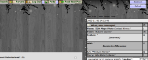
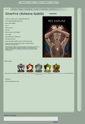
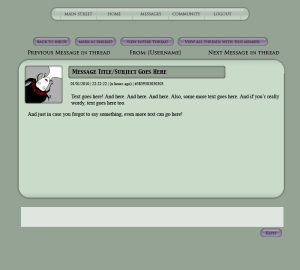
| Main Street - News - Main Street Poll - Daily Poem - Featured Story - Featured Art - Featured Member - Featured Wiki | Your House -profile -diary/blog/jo -guestbook -poll -statistics | Messages -Wheeee! x new messages! -inbox -outbox - view unread messages | Notes - Friend list? - the list of wikis you're watching/ownin - List of houses you're watching - List of forums you'rer a member of (should take you to the page where you can edit forum prios, etc.) - possibly a link to help page? | Forums - Forum replies - list of forums - more stuff... need to think more about this part. | Wiki - Index - Wiki Help - Community (community index page) - Competitions? (maybe would go somewhere else better?) |
 [Triola]
2015-01-08 [Nocturnaliss]: Seems also safe to say the moderator ticket system is down, because: http://www.elf
... what has Elfwood become ?!
2015-01-08 [Paul Doyle]: I think all the bad press about the Elfwood moderators proved to be the Achilles heel of Elfwood. I personally had a few very bad experiences with their moderators (along with some good experiences, to be fair) and stopped uploading to Elfwood several makeovers ago. The piss-poor attitude of some of the moderators, the Gestapo-like "ERB", the ridiculously long "ticket queues", and the toleration of all those Elfwood trolls, made updating Elfwood a chore.
While the circa-2004 Elfwood layout was user-unfriendl
2015-01-08 [Paul Doyle]: I can't log in at all. Apparently my email does not exist. *headdesk*
2015-01-08 [Paul Doyle]: Finally got in. If you had multiple accounts, use the last one ("pjdoyle3" worked for me).
Part of looking at this stuff is nostalgic; the other part makes me want to get the flamethrower.
2015-01-09 [Nocturnaliss]: I deleted my gallery several years ago, because of what you mentioned: the difficulty to upload, the time it took, how nitpicky they were about what fit into the genre... plus personal reasons, and having another gallery elsewhere (that, since then, has been deleted too).
All I really use now is Deviantart which, I must say, has been a pretty good place to be - but also because I know a few ET'ers on there (always comes back down to that, doesn't it?). Still, the community feel on there is not as strong as it is even on this dead site, which should be proof (and reason) enough to find a way to improve it, somehow, yet without losing its touch (as for what that 'touch' is, I don't know how to describe it. To me it feels like ET is a place away from time and reality, yet where you meet very real people. A place secluded from the horrors of the world, I guess).
... that got longer than anticipated. XD;
2015-01-30 [Stephen]: It's too bad we can't get Hedda on board with something.
2015-03-30 [kians mummy]: Yeah a lit of members want changes to here, look what happened to other Heddate sites, we need a more exciting welcoming look, writers this is nothing against you but we are in the modern age and this is starting to look a bit out dated and it needs to be acted upon before we start losing members.
2015-03-30 [Sunrose]: Tell Hedda, see if you can get him to do it. We have been unsuccesfull, obviously ..
2015-03-30 [Teufelsweib]: starting to look a bit out dated
start losing members
lawl
2015-03-30 [Paul Doyle]: This place looked sort of outdated in 2003, never mind 2015, but this place was jamming in 2003, and people were having a great time before the site completely lost its focus and appeal to the artistic-minde
And this place has been continuously losing members for what, five or six years now?
2015-03-30 [kians mummy]: Yes i agree [Paul Doyle] but we need to try what we can to keep the site going, if we all went to [Hedda] maybe we would get somewhere.
2015-03-31 [Paul Doyle]: Well, shit! Good luck with that! Honest to God . . .
2015-03-31 [kians mummy]: I agree.
2015-04-03 [Stephen]: DA beats Elftown hands down when it comes to focus on art. We're more of a community, yes, but just in terms of artistic focus we have nothing on them. :P
Hedda isn't very interested in things. I don't expect that'll change anytime soon.. :P
2015-04-03 [Paul Doyle]: Talking Heads "Road to Nowhere"
--------------
Well we know where we're goin'
But we don't know where we've been
And we know what we're knowin'
But we can't say what we've seen
And we're not little children
And we know what we want
And the future is certain
Give us time to work it out
We're on a road to nowhere
Come on inside
Takin' that ride to nowhere
We'll take that ride
I'm feelin' okay this mornin'
And you know,
We're on the road to paradise
Here we go, here we go
Maybe you wonder where you are
I don't care
Here is where time is on our side
Take you there...take you there
We're on a road to nowhere
We're on a road to nowhere
We're on a road to nowhere
There's a city in my mind
Come along and take that ride
and it's all right, baby, it's all right
And it's very far away
But it's growing day by day
And it's all right, baby, it's all right
They can tell you what to do
But they'll make a fool of you
And it's all right, baby, it's all right
We're on a road to nowhere
2015-04-26 [Nocturnaliss]: So, considering I've just read Silverfire is leaving ET, does this mean the site can finally be declared dead, and buried? In all honesty, I'd like to be able to delete my house, and move on from here. I hate hanging onto the thread of futile hope that ET 2.0 will one day exist.
2015-05-01 [Teufelsweib]: Yes, it is :/ not sure if theyll be an official statement though, Ill look into that
2015-05-04 [Stephen]: If a 2.0 existed, it would be a totally different site made by people who were interested in what we have here and making it elsewhere.
However, we lack coders and funds for that. :P
2015-07-29 [Akayume]: Is there a reason Hedda doesn't want to either change it himself or let someone else do the changes?
2015-08-20 [kians mummy]: Got an idea but unsure whether to put this up or not, why not have a five star rating on your house so that people can rate your profile, RP capability, poetry writings, story tellers, talkative and stuff like that. then each month find the most popular person then they get an award as Valued Member of the Month.
I truly believe an incentive like this may make it more exciting for other members here at Elftown, if you give them A great opportunity to win something, it could even better our members, and help boost our community.
Number of comments: 525
| Show these comments on your site |
|
Elftown - Wiki, forums, community and friendship.
|