| Entrance | Mainstreet | Wiki | Register |
|
# of watchers: 43
|
Fans: 0
| D20: 20 |
| Wiki-page rating |  Stumble! Stumble! |
| Informative: | 0 |
| Artistic: | 0 |
| Funny-rating: | 0 |
| Friendly: | 0 |


2010-04-02 [Kaimee]: Of course it's volunteer, you think Hedda has a payroll? xD *wishes*
And we may be getting some useless/impoli
2010-04-02 [Kuramasgirl]: Uhm...So it said to comment on the new layout? A little nervous about saying anything, since there appears to be a rather serious conversation going on. >>;
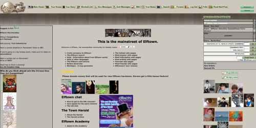
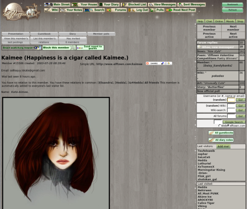
I really like the new layout, actually. I like the colors (or lack thereof, as some have said) and it just generally suits my visual tastes. Some changes here and there wouldn't hurt it (such as the links being a brighter color so they're more noticeable, including the new messages?), but overall I like the concept. It feels very fantasy-ish, which is why I was attracted to ET in the first place.
I don't know exactly if this is being considered for the official style of ET, as in to replace the green one (which would make me a bit sad...I'd like the green one to remain an option, and I feel almost protective about the old buttons...), but I would still like this to be a stylesheet option, maybe? Uhm..Yeah..So that's what I think. Just throwin' my two cents in. :)
2010-04-02 [*Phoenix*]: I really like it because it makes the banners and art POP! I like the feel or it. Feels more high-tech (?). I don't know how to explain it, but I really like it!
But I don't like how some of the buttons are still the old green...makes them look like puke. >.< I don't like how you can't tell between the bold and links. Maybe making the links a different shade like the old version or something. Also I some of the black words are hard to read on the dark background.
I can't wait to see what else is in sort for Elftown!! ^_^
2010-04-02 [Silver Moon]: I agree it is hard to distinguish between the links and normal type, and I think the color could have a little work, it hurts my eyes a little because I am straining to tell the difference between a link and a typed area
2010-04-02 [Guishy]: Even though its not finished yet, the new skin looks great! Love the way you grayed the wood patterns in the background.
2010-04-02 [Silver Moon]: is there a way to personally change it back? It hurts my eyes
2010-04-02 [shadow of darkness]: i must say, I do enjoy the change from the green, and the wood grain is intriguing. the grey just seems rather depressing to me though, the green was so vibrant and I dunno....happy
2010-04-02 [*Phoenix*]: I am actually beginning to enjoy it except for the fact that some things are hard to read and the still green buttons...
2010-04-02 [Company Awesome]: I miss the green. Where can I change back to the old skin? EDIT: It's a great layout but I'd like the choice to go back to green.
2010-04-02 [Calico Tiger]: Ok, a problem I did just recently discover with the new color layout, so keep it in mind (I do realize it's a WIP). Diary entries. They were color coded before. Certain color backgrounds for certain types of entries (friends only, public, personal/priva
2010-04-02 [Kaimee]: Cali: very easy fix, maybe post a thread in the suggestions forum to make sure Hedda sees it?
2010-04-02 [{*Suna's Kazekage*} Gaara]: I miss the green but I don't mind this new one.
2010-04-02 [Serwa]: It looks very cold, and unpersonal.
The green suited the theme of elftown, with the vines on the side etc. something forest-ish.
This has nothing fantasy about it, it would be totally okay for a floor-store.
Being used to the vines on the left side, it just looks weird to have the pictures stuck to the left side of my screen.
I like some space around pictures, makes them easier to look at. jammed to the left side of the screen is just a no-go for me. In a museum painting dont stand on the floor or are jammed into a corner somewhere. They get a bit of space, so they can be what they are: art. It just doesnt feel right.
The green one made elftown elftown..
In all its simplicity, and the fact that many people had contributed to it.
I believe there is an option in change profile to adjust the CSS coding you have behind the site. I think this belongs there. And maybe provide several more themes than the current four themes that are possible.
The whole reason why elftown would need a revamp is kind alost on me... if it was a change for the better I wouldnt mind. but the gray cold tones drain the fantasy-vibe out of this site for me.
Please let elftown be elftown and give us the green one back.
2010-04-02 [Silver Moon]: I agree with [Serwa] and as I said already the grey hurts my eyes and the links don't stand out
2010-04-02 [Chel.]: [Serwa] Thing is... Elftown has evolved so much in the past few years. It's not just fantasy anymore. There is a huge audience of sci-fi geeks here too. The "drained color" as you've said, also lets artwork stand on it's own. Art on the bright green can shift how one perceives it. With a dull tone, the art can be seen how it's supposed to be seen.
I do see how the paneling can be distracting when trying to read wiki's however. What if it was a little lighter to add contrast?
2010-04-02 [kay-chan]: I am so very hot for this layout right now. It'll just take some getting used to on my part. I would like a bit more color in the links and stuff, just to let me know it's not just bolded text.
2010-04-02 [Ocean Soul]: Despite Elftown having evolved past the pure fantasy community it started as, I don't think this is necessarily a call to completely abandon the fantasy theme. The question really is on this one whether or not you want to keep Elftown's heart based on a fantasy / mystical / foresty theme (as it's name would suggest), and if you want to move on to a more MySpacey / neutral sort of feel.
2010-04-02 [JaeMarix]: After spending more n more countless hours at elftown this style is a touch easier on the eyes being more cool/neutral colors.. The glowy/snow trails a nice touch as well! It would be nice to have some text/links brighter coloring as the grey/grey washes eachother out.. I am loving the effect photos are taking on but a touch of green leafy and or brown bordering would be nice with the gray wood grain backdrop..
2010-04-02 [Stephen]: Yeah, I think a side border of some kind would be nice, actually. I've always been a fan of that myself. Nothing too "BAM!" like, just something to add a little accent to things. =)
2010-04-02 [Mortified Penguin]: Private and public journal entries are the same color now...
2010-04-02 [Hedda]: The friends only diary notes are now in a different colour.
| Show these comments on your site |
|
Elftown - Wiki, forums, community and friendship.
|