| Entrance | Mainstreet | Wiki | Register |
|
# of watchers: 43
|
Fans: 0
| D20: 20 |
| Wiki-page rating |  Stumble! Stumble! |
| Informative: | 0 |
| Artistic: | 0 |
| Funny-rating: | 0 |
| Friendly: | 0 |


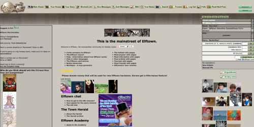
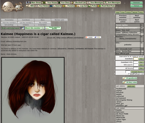
2010-04-01 [Veltzeh]: The background wood isn't grey, it's brown. It's just not very saturated, which I think is very good. Too much color is an eyesore!
2010-04-01 [Silver Moon]: I don't like it. I prefer the green background. I like the Elftown Icon but the color is too dull in my opinion
2010-04-01 [Chel.]: If the wood were brown... this place would look a bit too fantasy. We should take into consideration that this place has become quite the sci-fi realm too. The grey is very neutral so it wont react with art posted on it. Sort of like on DeviantArt.com
2010-04-01 [wicked fae mage]: <<< feels neutral since the winter time has been her default for a while
It reminds me of Shroomish... RIP
I'll use it for a few to see if it's any easier on my eyes though :3
2010-04-01 [Hiarhu]: I like it, it seems to be bringing a fresher look to Elftown that's been lacking for a while. A little bit of style beats plain bright green any day and the wood texture in the background is the best part. I look forward to seeing it when everything matches it.
2010-04-01 [Chishio]: its nice for a change, but and i liked the green. I agree with a few people grey is kinda gloomy.
2010-04-01 [another brick in the wall]: I'm not too xenophobic to hate the change from the get go. I can get used to it, but really the one thing that I have a real problem with is that the plan white message indicator is far far less noticable than the original blue-on-green. I'm afraid I wont notice new messages as quickly.
2010-04-01 [Ghost the Hybrid]: in my opinion they should have kept the old once and just added the new once that they changed to
2010-04-01 [Fearathress]: I personaly love it!!! Well done!
2010-04-01 [Madhalf Heatlump]: I love the style But I think the color should come up a bit...
2010-04-01 [Synirria]: I love it. We've needed something new for a while now. Keep up the great work!
2010-04-02 [Lirerial]: I love it too!
2010-04-02 [Kaimee]: Hmm, if the colours were overall slightly lighter and browner, would people prefer that? :)
2010-04-02 [Silver Moon]: I would have to see it to make a decision
2010-04-02 [Pnelma Tirian]: I think it's a fantastic change. A little bit more color wouldn't hurt, maybe a dark mahogany. Considering the site is called 'elftown' I think the science fiction artists and writers would understand if the site looked a little fantasy. I agree with Brick, though, the update color should be something vibrant, not white.
It's certainly a step in the right direction. Next, could we exchange the Microsoft Excel spreadsheet tables for a nicer interface?
2010-04-02 [Kaimee]: [Pnelma Tirian] Yes, we have been working on different layout concepts (rather than the tables! :P), one of the ones we've liked most is this:

...But whether that ever happens is still up for much debate, and lots of work :P
2010-04-02 [Silver Moon]: that looks neat
2010-04-02 [Kaimee]: Yeah, and I hope whoever earlier said the new style "looks like a someone in high school did this. Very unprofessional
2010-04-02 [Pnelma Tirian]: well that's impolite and useless criticism, isn't it? Isn't all of this work volunteered?
2010-04-02 [Kaimee]: Of course it's volunteer, you think Hedda has a payroll? xD *wishes*
And we may be getting some useless/impoli
| Show these comments on your site |
|
Elftown - Wiki, forums, community and friendship.
|