| Entrance | Mainstreet | Wiki | Register |
|
# of watchers: 43
|
Fans: 0
| D20: 20 |
| Wiki-page rating |  Stumble! Stumble! |
| Informative: | 0 |
| Artistic: | 0 |
| Funny-rating: | 0 |
| Friendly: | 0 |


2010-04-01 [Sunrose]: I wrote comments this afternoon :P
That button only shows you if any new comments were made after your own :p
2010-04-01 [Teufelsweib]: ehh it shows here too, the check for more comments, and there aren't any
2010-04-01 [Sunrose]: Because it only shows the new comments made after the last one you made, and no one did when you checked :PPP
2010-04-01 [Teufelsweib]: then why is the button there at all times? the only thing it does is lower itself half a centimeter when you click on it ><
2010-04-01 [Zab]: I like the new style :) And I hope you keep it after april too :P
2010-04-01 [Sauron]: Errr Deb, I think they lost the button somewhere during the "redecorations
Want me to call a private detective to track it down?
2010-04-01 [Zab]: hey...can't upload images to wikis..:( >_>
2010-04-01 [Sauron]: Oh wait, found it...
Right bellow the "box" where you write your comments, there's an "older comments: (Last 200).." ETC..
2010-04-01 [windowframe]: I can see it on other wikis - it's just this one that it's missing from. But it's not just the links that let you see past comments, but also the info about how many comments there are in total.
2010-04-01 [Ghost the Hybrid]: why couldn't you keep the old style as an option too? i liked the old valentine style but if i uses the new one i can't read anything but my presentation when i'm in my own house....
2010-04-01 [Sunrose]: @Silv: yea I noticed other wiki's still have the button/links to older comments :/
@Yume: Perhaps a special valentine version of this stylesheet will become available in time :)
What do you mean by not being able to read anything?
2010-04-01 [Amiantos Khronos]: April Fools joke? Haha.
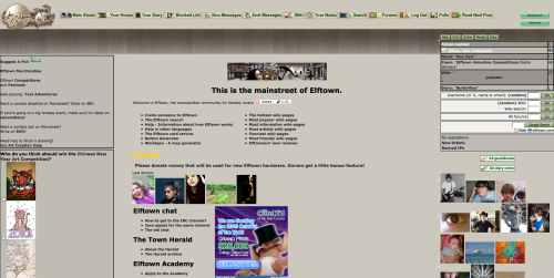
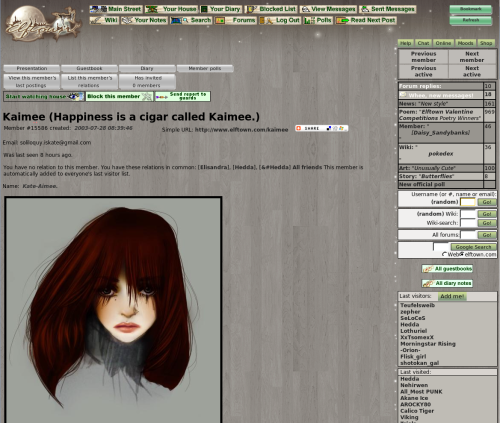
It's alright, but in my own opinion, I think it needs a bit of work to make it look more... hm... put together? I liked the green better as well. :o
2010-04-01 [Ghost the Hybrid]: well try use the valentine theme and try reading anything that doesn't have bottoms that's what i can't read if i uses the valentine theme
2010-04-01 [pegasus1000]: I like the gray, it is very friendly on the eyes. But for a small moment I thought I had stumbled into elfpack. I think I will miss the green for a while it was a friendly color.
2010-04-01 [Chel.]: Overall I think most people prefer it... from browsing the comments at least.
2010-04-01 [Calico Tiger]: Something I'm liking is the color of the green buttons below the "check for more comments" button. The combo of the purple, gray and green work out well, imho. Keeping something like that could help us stand out from looking like Elfpack. I absolutely love the grays that are being used :D But just a little green would help out :D
2010-04-01 [manwe]: the technical upgrades are good. i like that the login times (basically tracking devices) are gone.
however, i do not like the "artistic" style of the background.... i personally liked the look of the previous style. this one seems dreary and very grey (in a non-colour reference.) at least the green was "magic" and bright and friendly....
of course i suppose when one doesn't have a choice (which is what may happen) one can get used to anything or simply leave....
~ymmv
2010-04-01 [Sauron]: I think actually it should be brown and not grey, THEN the wood-look would be more fitting, and the green on the brown could look nice too..
2010-04-01 [Teufelsweib]: it would make the place look like a tree. which is kinda a nice idea actually!
2010-04-01 [Sauron]: Yeah! And what's with the grey anyway? Its a bit gloomy..
2010-04-01 [Veltzeh]: The background wood isn't grey, it's brown. It's just not very saturated, which I think is very good. Too much color is an eyesore!
| Show these comments on your site |
|
Elftown - Wiki, forums, community and friendship.
|