| Entrance | Mainstreet | Wiki | Register |
|
# of watchers: 43
|
Fans: 0
| D20: 20 |
| Wiki-page rating |  Stumble! Stumble! |
| Informative: | 0 |
| Artistic: | 0 |
| Funny-rating: | 0 |
| Friendly: | 0 |


2010-04-01 [Elysian Field Originals]: Very nice!
2010-04-01 [ursus_minor]: I'm sorry, but it looks like a someone in high school did this. Very unprofessional
2010-04-01 [Yuriona]: It is a work in progress you know and a negative comment like that doesn't help improve it any. Please give suggestions that will help to improve the new look rather than just flaming it because you can. :P
2010-04-01 [Teufelsweib]: it's as unprofessional not to back up your opinion ;)
2010-04-01 [Teufelsweib]: ehh fuck, yuri beat me *kicks dirt* :P
2010-04-01 [Yuriona]: Muahahahaha... >D
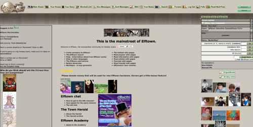
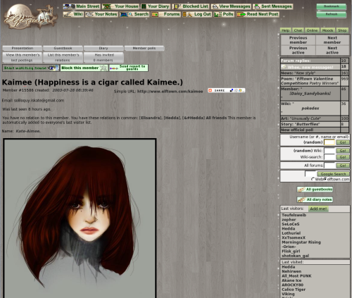
2010-04-01 [Veltzeh]: Looks very woody! :P
I think the background interferes with the text of wikipages a bit too much; it should be solid or at least have even less contrast on the wood pattern.
2010-04-01 [Sharky87]: It's a 1st of April joke..
2010-04-01 [Skydancer]: I would like it much better if the background were solid instead of a pattern. I find the pattern very distracting and hard on the eyes.The rest of it seems to be reasonable so far.
2010-04-01 [Daisy le Fleur]: I like the color scheme, it's modern and updated. Seems streamlined. I dont mind the paneling look, it keeps it from getting too far away from the natural/woodsy feel of Elftown.
2010-04-01 [Calico Tiger]: Hmmm... Veltzeh has a point. I didn't think about wiki page text and how it'd look on the background. It can be rather hard on the eyes at that point. Perhaps fade the background image a little bit? Or for wiki pages, it be just a solid gray in the wiki text box area? Like how the comment area is?
2010-04-01 [Mortified Penguin]: I'm going to assume this is an April Fools joke...
But if it's not, I will be killing someone. Do you know how many images I have with a plain, green background that now no longer match?
2010-04-01 [Morrigon]: Is it sad that I like the darkness? MWHAHAHAHAH
2010-04-01 [Sunrose]:
@Yur/Tw: We're asking for comments, not backed-up opinions or mere positive feedback ;)
@[ursus_minor]: It would be interesting though to hear what exactly you think is unprofessional
@Mort: Poor you.. :p
2010-04-01 [Mortified Penguin]: But... this wood is too flamable!
2010-04-01 [Sunrose]: Someone (Pillowthief) commented on the entrance image in the suggestions-fo
2010-04-01 [Veltzeh]: [Mortified Penguin]: You can always switch back to the green stylesheet if you like (at least after today, I'd imagine), but not all people use the green stylesheet anyway. Try to make transparent PNGs instead? Those work on everyone (as long as they have a newish browser)! :)
2010-04-01 [Mortified Penguin]: Making transparent PNGs wasn't an option at the time I uploaded most of the pictures, as all I have to work with is Paint.
2010-04-01 [Snow Leopard]: I think it looks pretty cool. The wikis are a little bit hard to read though.
2010-04-01 [popeyethecat]: It'll probably look good once it's finished. But it's a bit..sleek, and a bit dark
2010-04-01 [Ramirez]: Fantastic! Makes all the color just pop. XD;;;
| Show these comments on your site |
|
Elftown - Wiki, forums, community and friendship.
|