| Entrance | Mainstreet | Wiki | Register |
|
# of watchers: 43
|
Fans: 0
| D20: 20 |
| Wiki-page rating |  Stumble! Stumble! |
| Informative: | 0 |
| Artistic: | 0 |
| Funny-rating: | 0 |
| Friendly: | 0 |
2010-04-01 [Elysian Field Originals]: Very nice!
2010-04-01 [ursus_minor]: I'm sorry, but it looks like a someone in high school did this. Very unprofessional
2010-04-01 [Yuriona]: It is a work in progress you know and a negative comment like that doesn't help improve it any. Please give suggestions that will help to improve the new look rather than just flaming it because you can. :P
2010-04-01 [Teufelsweib]: it's as unprofessional not to back up your opinion ;)
2010-04-01 [Teufelsweib]: ehh fuck, yuri beat me *kicks dirt* :P
2010-04-01 [Yuriona]: Muahahahaha... >D
2010-04-01 [Veltzeh]: Looks very woody! :P
I think the background interferes with the text of wikipages a bit too much; it should be solid or at least have even less contrast on the wood pattern.
2010-04-01 [Sharky87]: It's a 1st of April joke..
2010-04-01 [Skydancer]: I would like it much better if the background were solid instead of a pattern. I find the pattern very distracting and hard on the eyes.The rest of it seems to be reasonable so far.
2010-04-01 [Daisy le Fleur]: I like the color scheme, it's modern and updated. Seems streamlined. I dont mind the paneling look, it keeps it from getting too far away from the natural/woodsy feel of Elftown.
2010-04-01 [Calico Tiger]: Hmmm... Veltzeh has a point. I didn't think about wiki page text and how it'd look on the background. It can be rather hard on the eyes at that point. Perhaps fade the background image a little bit? Or for wiki pages, it be just a solid gray in the wiki text box area? Like how the comment area is?
2010-04-01 [Mortified Penguin]: I'm going to assume this is an April Fools joke...
But if it's not, I will be killing someone. Do you know how many images I have with a plain, green background that now no longer match?
2010-04-01 [Morrigon]: Is it sad that I like the darkness? MWHAHAHAHAH
2010-04-01 [Sunrose]:
@Yur/Tw: We're asking for comments, not backed-up opinions or mere positive feedback ;)
@[ursus_minor]: It would be interesting though to hear what exactly you think is unprofessional
@Mort: Poor you.. :p
2010-04-01 [Mortified Penguin]: But... this wood is too flamable!
2010-04-01 [Sunrose]: Someone (Pillowthief) commented on the entrance image in the suggestions-fo
2010-04-01 [Veltzeh]: [Mortified Penguin]: You can always switch back to the green stylesheet if you like (at least after today, I'd imagine), but not all people use the green stylesheet anyway. Try to make transparent PNGs instead? Those work on everyone (as long as they have a newish browser)! :)
2010-04-01 [Mortified Penguin]: Making transparent PNGs wasn't an option at the time I uploaded most of the pictures, as all I have to work with is Paint.
2010-04-01 [Snow Leopard]: I think it looks pretty cool. The wikis are a little bit hard to read though.
2010-04-01 [popeyethecat]: It'll probably look good once it's finished. But it's a bit..sleek, and a bit dark
2010-04-01 [Ramirez]: Fantastic! Makes all the color just pop. XD;;;
2010-04-01 [Keno]: It's cool :)
2010-04-01 [Chel.]: [popeyethecat] - What do you mean about it being sleek? Shouldn't that be a good thing?
I understand the darkness thing.
2010-04-01 [Stephen]: I like it. =)
I find the darker color is more pleasing to the eyes, it makes text stand out better. Although, the grayish color on houses makes some of the lighter color donator tags hard to read, like the white on [Hedda]'s.
2010-04-01 [frogster]: Love it!! It is a welcomed change with great contrast for text. :D
2010-04-01 [Lothuriel]: I think it totally freakin' rox muh sox!!
2010-04-01 [Yncke]: I like the cleaned out right hand side. Perhaps the "All Guestbooks" and "All diary notes" can be unified too. Now they look a bit out of place.
And perhaps a good moment to PNGify the badges? :)
2010-04-01 [Himura Kenji]: I don't mind it! I kinda like it actually, change keeps things interesting.
2010-04-01 [nathie]: happy april fools day! :)
2010-04-01 [windowframe]: Aw bless, he thinks we're not serious. :3
2010-04-01 [KahanKiller]: i don't care for it :P
2010-04-01 [windowframe]: Any particular reason? Not a fan of the colours, is the text too hard to read, etc? What would make it better, in your opinion?
2010-04-01 [Forest Sage]: I love it!! ^_^
2010-04-01 [Titus (Cammy)]: The text isn't too hard to read, though the wooden floor boards make me feel like I'm trapped in a house. =( but I am at a loss as to what other textures you'd have to choose from. Full pictures wouldn't be too bad, but that's my pity opinion. Looks good!
2010-04-01 [Sauron]: Alright! I want to know who took my green away!
2010-04-01 [Delladreing]: Freaking in love with it. (The wood effect is somewhat strange, but that may be just me doing a Xenocide and trying to trace where all the grains go @_@ XD) but the colour is awesome as far as I'm concerned.
Due to the nature of my brainmeat and eyes I struggle to see things on a screen sans tinted glasses. (You look so cool while wearing them indoors during the winter kids, I cannot even begin to tell you, Fonzie ain't got nothin' on me. Translation: I look and feel like a pillock.) The green colouring of ET has always been good for me, it's one of the reasons I've stayed here so long, I can freaking see the text on the screen. And I know I'm not the only one because I've made several friends here and elswhere who enjoy using ET because it doesn't faff with our vision issues. The grey for some reason is just perfect, I'm not even remotely squinting at the screen right now :D I'm so happy over this it's pathetic XD
And streamlining of buttons is welcome. It's been a while since I've done any wiki work on here, I went to the sidebar to do something and went "oh..er..uhm..
2010-04-01 [Sauron]: But...the green.... :(
2010-04-01 [Sunrose]: Where did the 'older comments' button go, or did comments get deleted? O_o
2010-04-01 [Sauron]: Maybe there aren't any older comments?
2010-04-01 [Sauron]: Oh and there's this "check for more comments" under my comment!
2010-04-01 [Sunrose]: I wrote comments this afternoon :P
That button only shows you if any new comments were made after your own :p
2010-04-01 [Teufelsweib]: ehh it shows here too, the check for more comments, and there aren't any
2010-04-01 [Sunrose]: Because it only shows the new comments made after the last one you made, and no one did when you checked :PPP
2010-04-01 [Teufelsweib]: then why is the button there at all times? the only thing it does is lower itself half a centimeter when you click on it ><
2010-04-01 [Zab]: I like the new style :) And I hope you keep it after april too :P
2010-04-01 [Sauron]: Errr Deb, I think they lost the button somewhere during the "redecorations
Want me to call a private detective to track it down?
2010-04-01 [Zab]: hey...can't upload images to wikis..:( >_>
2010-04-01 [Sauron]: Oh wait, found it...
Right bellow the "box" where you write your comments, there's an "older comments: (Last 200).." ETC..
2010-04-01 [windowframe]: I can see it on other wikis - it's just this one that it's missing from. But it's not just the links that let you see past comments, but also the info about how many comments there are in total.
2010-04-01 [Ghost the Hybrid]: why couldn't you keep the old style as an option too? i liked the old valentine style but if i uses the new one i can't read anything but my presentation when i'm in my own house....
2010-04-01 [Sunrose]: @Silv: yea I noticed other wiki's still have the button/links to older comments :/
@Yume: Perhaps a special valentine version of this stylesheet will become available in time :)
What do you mean by not being able to read anything?
2010-04-01 [Amiantos Khronos]: April Fools joke? Haha.
It's alright, but in my own opinion, I think it needs a bit of work to make it look more... hm... put together? I liked the green better as well. :o
2010-04-01 [Ghost the Hybrid]: well try use the valentine theme and try reading anything that doesn't have bottoms that's what i can't read if i uses the valentine theme
2010-04-01 [pegasus1000]: I like the gray, it is very friendly on the eyes. But for a small moment I thought I had stumbled into elfpack. I think I will miss the green for a while it was a friendly color.
2010-04-01 [Chel.]: Overall I think most people prefer it... from browsing the comments at least.
2010-04-01 [Calico Tiger]: Something I'm liking is the color of the green buttons below the "check for more comments" button. The combo of the purple, gray and green work out well, imho. Keeping something like that could help us stand out from looking like Elfpack. I absolutely love the grays that are being used :D But just a little green would help out :D
2010-04-01 [manwe]: the technical upgrades are good. i like that the login times (basically tracking devices) are gone.
however, i do not like the "artistic" style of the background.... i personally liked the look of the previous style. this one seems dreary and very grey (in a non-colour reference.) at least the green was "magic" and bright and friendly....
of course i suppose when one doesn't have a choice (which is what may happen) one can get used to anything or simply leave....
~ymmv
2010-04-01 [Sauron]: I think actually it should be brown and not grey, THEN the wood-look would be more fitting, and the green on the brown could look nice too..
2010-04-01 [Teufelsweib]: it would make the place look like a tree. which is kinda a nice idea actually!
2010-04-01 [Sauron]: Yeah! And what's with the grey anyway? Its a bit gloomy..
2010-04-01 [Veltzeh]: The background wood isn't grey, it's brown. It's just not very saturated, which I think is very good. Too much color is an eyesore!
2010-04-01 [Silver Moon]: I don't like it. I prefer the green background. I like the Elftown Icon but the color is too dull in my opinion
2010-04-01 [Chel.]: If the wood were brown... this place would look a bit too fantasy. We should take into consideration that this place has become quite the sci-fi realm too. The grey is very neutral so it wont react with art posted on it. Sort of like on DeviantArt.com
2010-04-01 [wicked fae mage]: <<< feels neutral since the winter time has been her default for a while
It reminds me of Shroomish... RIP
I'll use it for a few to see if it's any easier on my eyes though :3
2010-04-01 [Hiarhu]: I like it, it seems to be bringing a fresher look to Elftown that's been lacking for a while. A little bit of style beats plain bright green any day and the wood texture in the background is the best part. I look forward to seeing it when everything matches it.
2010-04-01 [Chishio]: its nice for a change, but and i liked the green. I agree with a few people grey is kinda gloomy.
2010-04-01 [another brick in the wall]: I'm not too xenophobic to hate the change from the get go. I can get used to it, but really the one thing that I have a real problem with is that the plan white message indicator is far far less noticable than the original blue-on-green. I'm afraid I wont notice new messages as quickly.
2010-04-01 [Ghost the Hybrid]: in my opinion they should have kept the old once and just added the new once that they changed to
2010-04-01 [Fearathress]: I personaly love it!!! Well done!
2010-04-01 [Madhalf Heatlump]: I love the style But I think the color should come up a bit...
2010-04-01 [Synirria]: I love it. We've needed something new for a while now. Keep up the great work!
2010-04-02 [Lirerial]: I love it too!
2010-04-02 [Kaimee]: Hmm, if the colours were overall slightly lighter and browner, would people prefer that? :)
2010-04-02 [Silver Moon]: I would have to see it to make a decision
2010-04-02 [Pnelma Tirian]: I think it's a fantastic change. A little bit more color wouldn't hurt, maybe a dark mahogany. Considering the site is called 'elftown' I think the science fiction artists and writers would understand if the site looked a little fantasy. I agree with Brick, though, the update color should be something vibrant, not white.
It's certainly a step in the right direction. Next, could we exchange the Microsoft Excel spreadsheet tables for a nicer interface?
2010-04-02 [Kaimee]: [Pnelma Tirian] Yes, we have been working on different layout concepts (rather than the tables! :P), one of the ones we've liked most is this:
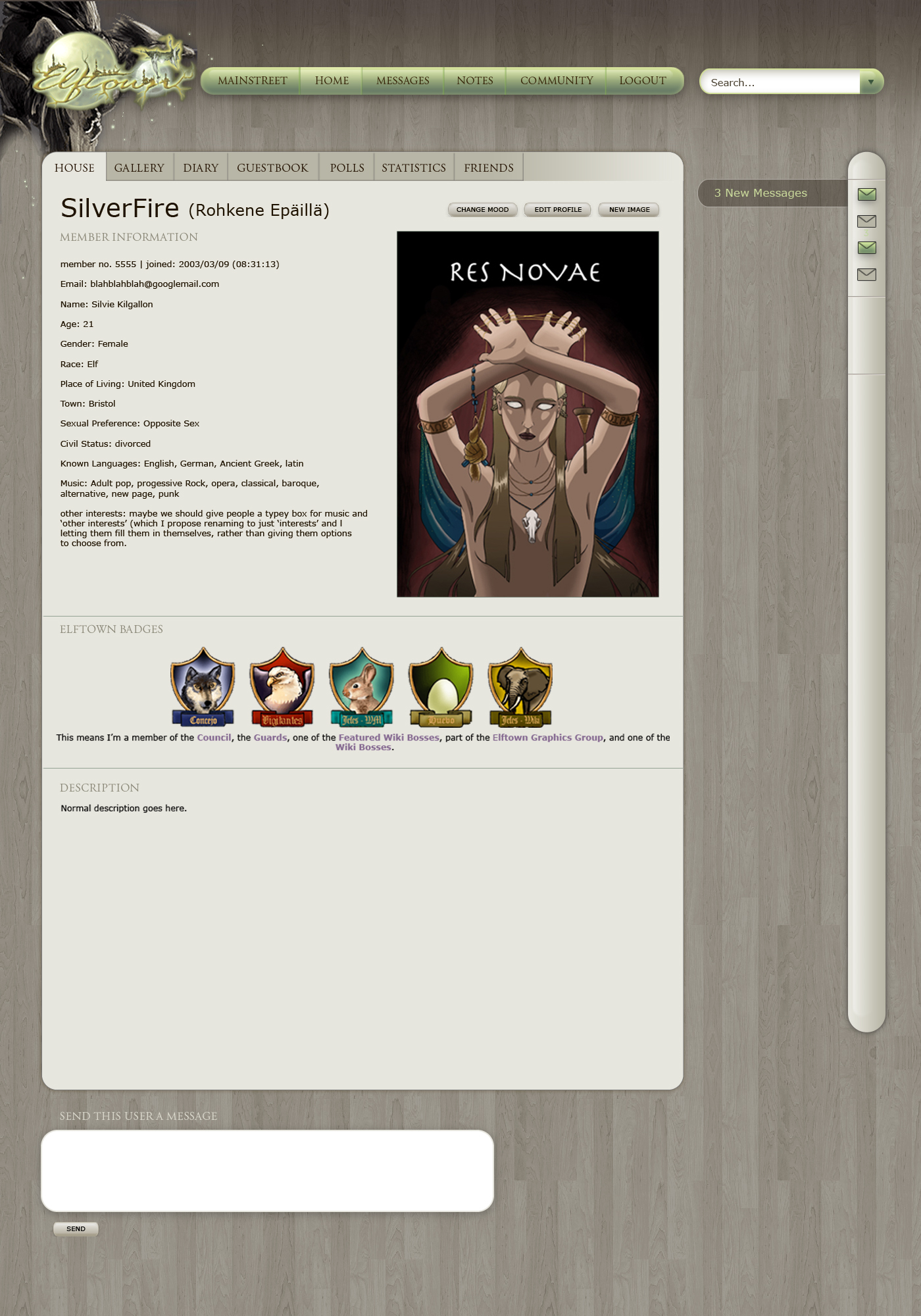
...But whether that ever happens is still up for much debate, and lots of work :P
2010-04-02 [Silver Moon]: that looks neat
2010-04-02 [Pnelma Tirian]: yesss! that's kickin' rad! Man I hope it comes true!
2010-04-02 [Kaimee]: Yeah, and I hope whoever earlier said the new style "looks like a someone in high school did this. Very unprofessional
2010-04-02 [Pnelma Tirian]: well that's impolite and useless criticism, isn't it? Isn't all of this work volunteered?
2010-04-02 [Kaimee]: Of course it's volunteer, you think Hedda has a payroll? xD *wishes*
And we may be getting some useless/impoli
2010-04-02 [Kuramasgirl]: Uhm...So it said to comment on the new layout? A little nervous about saying anything, since there appears to be a rather serious conversation going on. >>;
I really like the new layout, actually. I like the colors (or lack thereof, as some have said) and it just generally suits my visual tastes. Some changes here and there wouldn't hurt it (such as the links being a brighter color so they're more noticeable, including the new messages?), but overall I like the concept. It feels very fantasy-ish, which is why I was attracted to ET in the first place.
I don't know exactly if this is being considered for the official style of ET, as in to replace the green one (which would make me a bit sad...I'd like the green one to remain an option, and I feel almost protective about the old buttons...), but I would still like this to be a stylesheet option, maybe? Uhm..Yeah..So that's what I think. Just throwin' my two cents in. :)
2010-04-02 [*Phoenix*]: I really like it because it makes the banners and art POP! I like the feel or it. Feels more high-tech (?). I don't know how to explain it, but I really like it!
But I don't like how some of the buttons are still the old green...makes them look like puke. >.< I don't like how you can't tell between the bold and links. Maybe making the links a different shade like the old version or something. Also I some of the black words are hard to read on the dark background.
I can't wait to see what else is in sort for Elftown!! ^_^
2010-04-02 [Silver Moon]: I agree it is hard to distinguish between the links and normal type, and I think the color could have a little work, it hurts my eyes a little because I am straining to tell the difference between a link and a typed area
2010-04-02 [Guishy]: Even though its not finished yet, the new skin looks great! Love the way you grayed the wood patterns in the background.
2010-04-02 [Silver Moon]: is there a way to personally change it back? It hurts my eyes
2010-04-02 [shadow of darkness]: i must say, I do enjoy the change from the green, and the wood grain is intriguing. the grey just seems rather depressing to me though, the green was so vibrant and I dunno....happy
2010-04-02 [*Phoenix*]: I am actually beginning to enjoy it except for the fact that some things are hard to read and the still green buttons...
2010-04-02 [Company Awesome]: I miss the green. Where can I change back to the old skin? EDIT: It's a great layout but I'd like the choice to go back to green.
2010-04-02 [Calico Tiger]: Ok, a problem I did just recently discover with the new color layout, so keep it in mind (I do realize it's a WIP). Diary entries. They were color coded before. Certain color backgrounds for certain types of entries (friends only, public, personal/priva
2010-04-02 [Kaimee]: Cali: very easy fix, maybe post a thread in the suggestions forum to make sure Hedda sees it?
2010-04-02 [{*Suna's Kazekage*} Gaara]: I miss the green but I don't mind this new one.
2010-04-02 [Serwa]: It looks very cold, and unpersonal.
The green suited the theme of elftown, with the vines on the side etc. something forest-ish.
This has nothing fantasy about it, it would be totally okay for a floor-store.
Being used to the vines on the left side, it just looks weird to have the pictures stuck to the left side of my screen.
I like some space around pictures, makes them easier to look at. jammed to the left side of the screen is just a no-go for me. In a museum painting dont stand on the floor or are jammed into a corner somewhere. They get a bit of space, so they can be what they are: art. It just doesnt feel right.
The green one made elftown elftown..
In all its simplicity, and the fact that many people had contributed to it.
I believe there is an option in change profile to adjust the CSS coding you have behind the site. I think this belongs there. And maybe provide several more themes than the current four themes that are possible.
The whole reason why elftown would need a revamp is kind alost on me... if it was a change for the better I wouldnt mind. but the gray cold tones drain the fantasy-vibe out of this site for me.
Please let elftown be elftown and give us the green one back.
2010-04-02 [Silver Moon]: I agree with [Serwa] and as I said already the grey hurts my eyes and the links don't stand out
2010-04-02 [Chel.]: [Serwa] Thing is... Elftown has evolved so much in the past few years. It's not just fantasy anymore. There is a huge audience of sci-fi geeks here too. The "drained color" as you've said, also lets artwork stand on it's own. Art on the bright green can shift how one perceives it. With a dull tone, the art can be seen how it's supposed to be seen.
I do see how the paneling can be distracting when trying to read wiki's however. What if it was a little lighter to add contrast?
2010-04-02 [kay-chan]: I am so very hot for this layout right now. It'll just take some getting used to on my part. I would like a bit more color in the links and stuff, just to let me know it's not just bolded text.
2010-04-02 [Ocean Soul]: Despite Elftown having evolved past the pure fantasy community it started as, I don't think this is necessarily a call to completely abandon the fantasy theme. The question really is on this one whether or not you want to keep Elftown's heart based on a fantasy / mystical / foresty theme (as it's name would suggest), and if you want to move on to a more MySpacey / neutral sort of feel.
2010-04-02 [JaeMarix]: After spending more n more countless hours at elftown this style is a touch easier on the eyes being more cool/neutral colors.. The glowy/snow trails a nice touch as well! It would be nice to have some text/links brighter coloring as the grey/grey washes eachother out.. I am loving the effect photos are taking on but a touch of green leafy and or brown bordering would be nice with the gray wood grain backdrop..
2010-04-02 [Stephen]: Yeah, I think a side border of some kind would be nice, actually. I've always been a fan of that myself. Nothing too "BAM!" like, just something to add a little accent to things. =)
2010-04-02 [Mortified Penguin]: Private and public journal entries are the same color now...
2010-04-02 [Hedda]: The friends only diary notes are now in a different colour.
2010-04-02 [Zab]: aw it changed back.. I got an idea/taste for a light brownish background with a slight tree trunk texture, going along with the vines and such..
2010-04-02 [Stephen]: Hm. Hopefully it goes back to the more toned down one again. xD
2010-04-02 [Zab]: Hm? It's back to the green for me..O__o
2010-04-02 [Stephen]: I mean the brown one. xD
2010-04-02 [Sauron]: YAY THE GREEN IS BACK!!!!!!!!
2010-04-02 [Evolution X]: that is a very long implimented april's fools joke... how long did it actually take to code those pages to look like that?
2010-04-02 [Calico Tiger]: A long time. Because it wasn't really a full April Fool's joke :) Elftown really is being reworked and redesigned. This was a great way to get some feedback on some of the parts :D
2010-04-02 [Chel.]: We are still working on it... please keep leaving feedback!
2010-04-02 [Evolution X]: Ok, well black on green is a quite distinct colour, easy to read and discern what's being written. If it's black on grey, if the computer does not have a very well lit screen, it might be difficult to see for some people... So if there is a colour change I'd suggest grey isn't too good. Just a suggestion really...
2010-04-02 [Chel.]: What would you suggest?
2010-04-02 [Evolution X]: I dunno... *scratches my head* I'm used to green... it's a neutralistic colour that doesn't make it difficult to read or hurt your eyes from staring at it for too long. Yellow and red would probably do that. Perhaps a blue colour? Can't be too dark or similar to the text... *shrugs*
2010-04-02 [Chel.]: I suppose I would be fine if the paneling was lightened to contrast the black more.
2010-04-02 [Azuri]: It needs to be finished up completely but I really liked it and think it would be great :)
2010-04-02 [Himura Kenji]: well if it was buggy, then okay, but it was still cool, I changed my house becuase of the new style, and I liked it. I hope it does become a permanent option later on!
2010-04-02 [Teufelsweib]: you can still use it as a stylesheet, explained above :D
2010-04-02 [Gypsy Mystik]: I love the Green BUT I love the coiver icon for the April background
2010-04-02 [Azuri]: I already changed mine back to it :)
2010-04-02 [Silver Moon]: I liked the ET icon too
2010-04-02 [pegasus1000]: I went to use the style sheet and here are my personal Pros, Cons, Suggestions
-The wood plank background could be a lighter gray so that the text on the pages could be read easier. Or the texture could be less outstanding, it was a little distracting. Bold text is easy to read, but not normal text.
- After spending some time on the site with the style sheet I found that my eyes had grown tired. While with the green I can read for hours without a problem.
+ I Really liked the color for the comment sections and in the homes. It was nice on my eyes.
- One problem I saw was when I was looking at the updated pages on the side bar, the blue was not easy to read and I almost missed it.
+The backgrounds for the daily poems and featured members. It was nice and made the text easy to read.
-Some of the older badges (Like my greateldar badge for poetry corner) would need to be updated so that the background would blend in to the new layout.
* If a new permanent style were to take over the green would you want to redo the green badges?
+ I liked the night time feel to the layout. The stars and new logo. I do agree that a side design would be needed. If I were to do the design I would try to meld the night time them with the forest them. A mixture of stars and vines perhaps.
* If you wanted to chose another color I would go with a light purple or a grayish purple.
I think that’s it. But on a side note when I switched back to green I had a shock to my eyes (It’s so bright!!)
2010-04-02 [Alexi Ice]: I like it, personally, except the color is a bit hard on my eyes.
2010-04-02 [Fearathress]: A little help please; I keep trying to upload the style sheet but I keep getting error notices. What do you put in the stylesheet to use box?
2010-04-02 [Veltzeh]: Just "_2010-04-01.c
2010-04-02 [Madhalf Heatlump]: I actually think it is a great direction... it looked cool!
2010-04-02 [~Nyx~]: Please get rid of the leaves. :)
I've changed back to the grey allready. MUCH better. :D
2010-04-02 [Zab]: I love the newer stylesheet, but I'll have to change back everytime I want to upload a picture? :( (to a wiki that is, works fine on the house)
2010-04-02 [Gypsy Mystik]: the newer icon is what I liked... but prefered the green
2010-04-03 [Fearathress]: Thank you [Veltzeh].
2010-04-03 [Serwa]: Thank god. Welcome back green elftown.
2010-04-03 [Hedda]: [Zab]: You can upload the image with the "Upload image" button.
The "upload file" button is also removed from that stylesheet (And for all you who don't have special privs). There are loads of demands about that Elftown should remove all that crap that someone isn't using. As you notice, that doesn't work as "all that crap that someone isn't using" isn't the same for all people.
2010-04-03 [Kaimee]: Hmm, I wonder if there's some way to see statistics on how many people end up using the different stylesheet...? :)
2010-04-03 [Chel.]: Can we like... make a poll or something?
2010-04-03 [Stephen]: Like a new Mainstreet poll?
2010-04-03 [elfflower1989]: My issue is that grey is associated with elfpack...
2010-04-03 [nehirwen]: Does that include the ones that use her firefly stylesheet?
2010-04-03 [Sunrose]: I think a lot of people don't know how to get it back, even when you explain it..
2010-04-04 [Mortified Penguin]: Click this:

Go here:

Paste this:
http://elftown
Save changes.
Eat at Bob's Diner.
2010-04-04 [Kaimee]: Thanks mort :p
2010-04-04 [Mortified Penguin]: Though for some reason the stylesheet doesn't seem to want to work on Firefox on my computer, but it works with Explorer. Not sure why... probably [Sunrose]'s fault.
2010-04-04 [Synirria]: Lmao...I use firefox and it works great for mine. Sorry, to hear its not working
2010-04-04 [Kaimee]: It's working with firefox, and safari on mine. Try clearing your cache, or holding down shift-ctrl-r or shift-f5 to do a clean refresh.
2010-04-04 [Mortified Penguin]: Yes, I figured it was only my computer, because my computer is a huge douche. Literally. Which is probably one of the main reasons it fails at performing the simplest of computing tasks...
2010-04-04 [pegasus1000]: Make sure there is no space after your .css I had that problem the first time I tried to use the style sheet.
2010-04-05 [Sunrose]: I guess your computer just takes after you mort :P
2010-04-05 [*Phoenix*]: I missed the new layout, but I really think we should switch. It would be a nice change esp if you implicated some of the original green ideas. Like the leafy border, etc.
2010-04-05 [*Phoenix*]: does anyone know how to make a screen shot picture on a PC like the ones above?
2010-04-05 [Chel.]: Depends on your keyboard. There might be a "printscreen" button on the top right.
2010-04-05 [*Phoenix*]: eck...I don't want to print it...
2010-04-05 [Fearathress]: It won't print it it will take a picture of you screen which you can this save. Though to save it on my computer you have to copy and paste in paint.
2010-04-05 [Sunrose]: The printscreen button makes a 'picture' of your screen, that you can paste in a program (including for instance Word, if you'd like to test it) :)
2010-04-05 [*Phoenix*]: The button says "Print screen | sys Rq" (there's a line). I hit shift and it didn't do anything....
Edit: it still won't..
2010-04-05 [Madhalf Heatlump]: I had to press shift+print screen but it worked :)
2010-04-05 [*Phoenix*]: Does something pop up? Because nothing's happening...
2010-04-05 [Madhalf Heatlump]: nope... you just go to word or whatever and paste it.
2010-04-05 [*Phoenix*]: paste what?
2010-04-05 [Fearathress]: go to word or paint and just do crltV it will automaticaly paste the picture of your screen that you took when you pressed printscreen
2010-04-05 [*Phoenix*]: Everyone here teaches me so much...even when I get really confused. >.<
Thanks everyone! *group hugs*
2010-04-05 [Fearathress]: Great!
2010-04-05 [*Phoenix*]: :) Whooo! Now I'm having fun with new knowledge!!
| Show these comments on your site |
|
Elftown - Wiki, forums, community and friendship.
|